SEE Pest and Lawn Gets a New Look
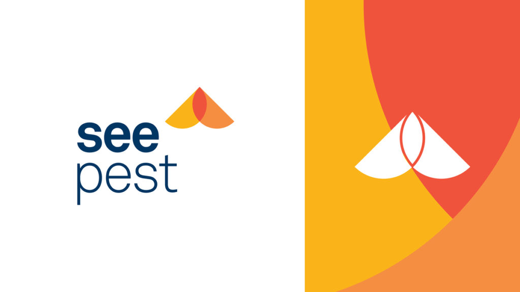
SEE Pest & Lawn came to Neff in 2019 to help conduct a brand redesign. We collaborated to help simplify and update SEE’s brand into two unique business marks that also function as part of the larger set. Each logo works from the same core elements but utilizes those elements differently. The icon flips 180 degrees in orientation depending on the service it’s representing.
![]()
See Pest uses the icon in the top right corner of the word mark to symbolize a bug or moth in flight. See Lawn uses the icon on the lower left, anchoring it on the base of the wordmark. It is rotated 180 degrees from the Pest icon, to symbolize a bud, plant or lawn in growth. The wordmark for both logos uses a simple sans serif typeface with the word “see” in bold and “pest” or “lawn” thinner to increase readability.