January 7, 2023
Our Ad Agency in Philadelphia Helps You Tell Your Story...
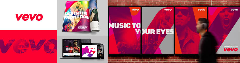
Logos have always been an important part of a brand identity. When done correctly they intentionally communicate to customers and become the mark that represents a company. It’s a first impression, and when the competition is in print, on the air and on the web, those first impressions are important. Apple is clean and understated, Harley Davidson is rugged and tough and Stride Rite is playful and geared toward children. Even if you weren’t familiar with the brands these characteristics are completely visible in the logo.
With all this weight placed on logo design, it’s a process where corners shouldn’t be cut, but there is a huge pool of websites urging people to take a quick way out of proper logo development. They boast that they can develop a logo in 24 hours or make the process convenient by letting customers choose from a kit of premade icons. The end result is usually dated, poorly constructed and identical with dozens of other logos on the market. The process for logo development is one that takes a lot of thought and time. If someone is building a logo in 24 short hours, chances are the logo isn’t getting enough of either. A first impression and timeless visual mark deserve consideration with these key principles in mind.

Simple
A logo should visually represent the phrase “quick and to the point”! It should be quickly recognizable and not muddled with unnecessary bells and whistles. Clear communication is key and it lends itself to keeping the logo adaptable.
Adaptable
A successful logo needs to work well on mediums outside of just business cards and storefronts. How well does it translate at several feet large on a billboard? How about as a 16×16 pixel favicon on a website? A logo’s success can be measured by its ability to be expanded and broken down while still communicating.

Appropriate
A bright, multicolored palette may not work for a law firm logo and a dark, somber typeface wouldn’t do a great job of representing a children’s toy; they wouldn’t be appropriate. Paying attention to color and typeface may seem subtle, but a lot of miscommunication can happen when the appropriateness of these elements aren’t considered.
Logo development is a process that deserves thought, not a quick fix. When making a logo, make sure to go a route where these three principles will be considered!