 Get In Touch
 Get In Touch
Your brand is more than just a logo. It’s the entire integrated experience that tells the story of who you are and what you stand for. Your brand is not any one thing –– it’s your culture, your content, your marketing, and your team. In 2020, make it a goal to build your brand using an integrated strategy.
You want to make a meaningful, positive impression. Therefore, your brand should establish an emotional connection and build trust with your target audience, generating new customers and affirming your relationship with current ones. You should have a distinct look that sets you apart as well as messaging that shares your mission and your unique voice.
Working with an agency can help guide you through the branding process. As a top marketing agency in Philadelphia, Neff leverages integrated services to tell brand stories from all angles. Consider what you might need and how you like to collaborate when choosing an agency partner.

You can think of a brand like a person with specific characteristics. For instance, your brand personality is the unique qualities that make you different than other brands and appealing to your target audience. Are you funny? Sophisticated? Adventurous? Your brand personality will help to create a personal connection with prospective customers.
Consider what service you offer and why. Your brand should communicate what you do, so it’s crucial to have a clear understanding of the problem you solve. For instance, do you offer a product that meets a specific need, or a more intangible service like peace of mind? When prospective customers view your marketing media, they should understand your value right away.

Your brand is a conversation with your target audience. In order to make sure you’re reaching the right people, take some time to consider who they are. One way is to develop buyer persona profiles to reference when building your identity. Creating buyer personas is just one part of Neff’s extensive brand audit process. Pinpointing the user will help you tailor your messaging accordingly.
Understanding your competitors will ensure that you know how to stand out in your market. What do you offer that they don’t? Why should a prospective client choose you? The answer to this will directly inform your visual identity, which will serve to remind your audience of your added value. Your strategy will communicate these unique characteristics.

After considering your brand personality, target audience, and unique selling propostion, you need to use this information to build and promote a brand. It’s crucial to have a well thought out strategy because the quality of your brand represents the quality of your business.
You’ll want to create a visual identity and corresponding messaging in a clear design system. This system needs to be flexible and scalable across platforms and audiences. Leverage other services as needed in your brand strategy. Partnering with an integrated agency where you can get everything you need in one place can save you time, money, and effort.
Video and social media are dynamic storytelling tools that are a great way to connect with your audience. You can also use PR to spread brand awareness and thought leadership in relevant markets. Whatever tools you end up using in your marketing strategy, make sure that you’re connecting emotionally with your audience. Be authentic, and create a brand that accurately represents who you are.
As businesses strive for innovative solutions in an evolving marketplace, it becomes increasingly important to provide the best customer experience (CX). It’s about how the audience experiences your brand. This is often different from internal assumptions. Effective CX takes place at every step of the way. This process will provide design validation for customer experiences.
User experience (UX) design is commonly misunderstood. Some people believe it is only involved in websites and apps. Others think it means wireframes. Wireframes are simply a tool for UX Designers to show the interactive content structure. Of course, a UX process should be part of any interactive project. However, user experience design is more than this.
Yes, your creative team went to school, and have plenty of prior experience, but every situation is unique. There are plenty of traditional marketing techniques, which we can combine with new ideas. The trick to finding the right approach often lies in testing the user experience. This is done with consumer research. Digital products benefit from user testing. However, these techniques can be just as useful for traditional marketing strategies. We use a human-centered design approach. This frame our thinking to achieve valuable results.
Your campaign or product has to look and feel good. However, it takes more than this to verify a design will be successful. Our design process begins with defining measurable goals for each project. First, we gather research. This informs a strategic project plan. After that, we are able to tailor creative services to the unique details of your project.
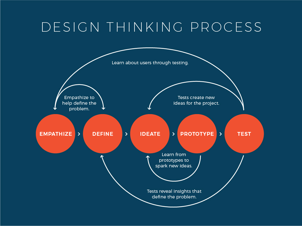
There are a variety research methods for validation. These can be used to measure success at many points. These include moderated and unmoderated user tests. A/B testing can be used to compare two potential solutions. Also, we use surveys and focus groups.
Businesses across many industries can use these approaches for integrated marketing campaigns and experiences. For example, we can compare two billboard designs. An A/B test can compare leads generated from each ad. Websites can also benefit from user tests. These tests could verify that users were able to efficiently locate certain information. Strong designs help business and consumers. Design validation for customer experiences can drive profits and create more useful products.
In 2017 we celebrated our 30th anniversary, and after three decades of marketing excellence in Philadelphia, it was time to update our brand and redefine our mission. We moved on from a brand presence that felt like it was created 30 years go (because, well, it was) to something that reflects our growth and who we are today. So our team and owner, David Neff, took a closer look at our brand, where it came from, and where we want it to go. Have a look at the Neff rebrand process below.
In marketing and advertising, your brand name is synonymous with who you are, what you do and what you stand for. With that, the first thing we wanted to redefine was our mission and our name. We agreed that Neff Associates sounded too buttoned up and old fashioned, more like a law firm than a modern agency, and it didn’t represent who we are. After endless rounds of brainstorming, SWOT analyzing, and a little bit of debate, we concluded that there’s no word that can encompass everything we do. We’re a collaborative full-service agency, meaning we cover all of our clients’ marketing and advertising needs from branding and websites, to public relations and social media, to media strategy, to videography and photography, and everything in between. How could we possibly narrow all of that down to one word or phrase?
We wanted to contemporize our image, to simplify and reflect who we are today.
David Neff, President and CEO
So, we thought, what else could describe who we are? How do people know us? In casual conversation, both internally and with clients, we’ve always cut it short to just “Neff.” Maybe that’s all we needed to be, maybe the new name didn’t have to be totally different, but just instituting a simple phrase that we already use. It was an easy decision; we unanimously decided we are now “Neff!” Goodbye to that stuffy suffix.
Re-branding as Neff would present the opportunity to showcase our creative work and unique office culture. During the process, we took a deeper look at who Neff is. And no, we don’t just mean the guy who started the agency, but the business and the culture he has grown so vastly over the last thirty years. The twenty-three faces who show up to the office every day ready to create and collaborate, the dozens of awards that adorn our lobby walls, the portfolio of work that amazes potential partners every day, the long list of happy clients that span almost every possible industry, the office dogs who give endless kisses, and everything in between. This was all deeply considered during the Neff rebrand.
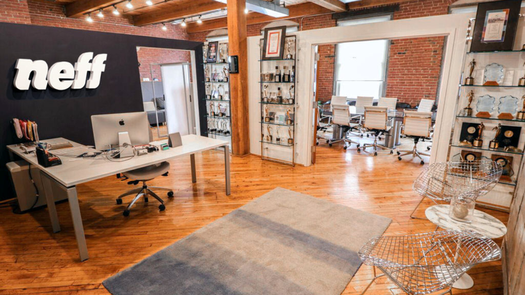
After 30 years, we still have that startup mentality. We hustle and don’t quit, we do whatever it takes to help our clients succeed and builds relationships with those clients. Neff is a full-service marketing agency based in Old City, Philadelphia. Our mission is to use integrated strategies to tell your story and expand your brand. We thrive on collaboration, creativity, and forming strong relations, both internally and with every client.
Great! Now how do we create a logo that encompasses all of that? It was time to put pencil to paper. We first explored dozens of rounds of sketches with the team, breaking one of our biggest rules by involving the whole office every step of the way. But it was important to get every single person’s input, because we all work as a team, and the creative influence of the social and PR teams was just as important as the ideas coming from our designers.
Our first round of sketches consisted of logos from all walks of life: tall, short, wide, thin, square, round. We thought everywhere except inside the box. In the first few rounds of drafts we explored many different logo styles: iconographic, typographic, minimalist, detailed, hand drawn, etc. Seeing all of these different options made the team think even deeper about who we are and how we could show that.
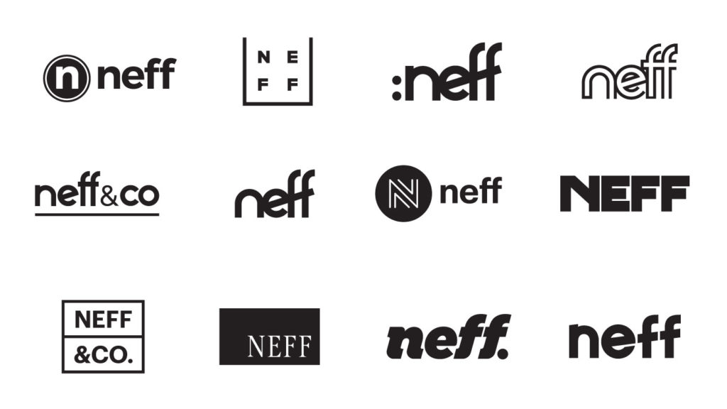
As we narrowed down the logo choices, we paid attention to how we reacted to each design, how each idea correlated with the work that we do for clients and how they connected to our culture. We decided on a direction that was simple, yet bold. This approach would capture the viewers eye, but in an understated way.
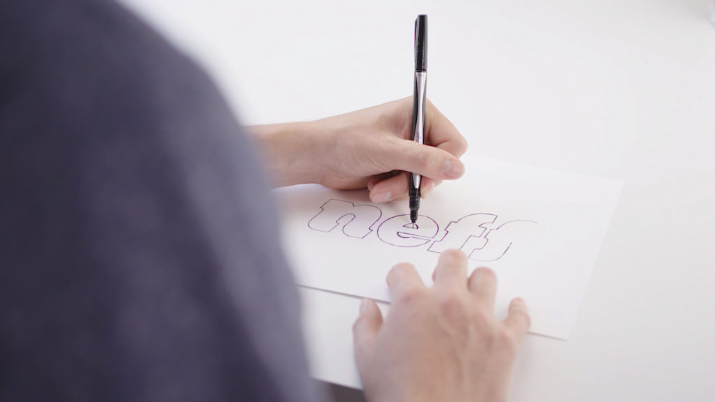
Getting closer and closer to our final mark, we started developing a custom typography solution. What kind of creative agency would we be if we just picked a font and used it? Our designers worked hard to make sure every angle, every curve, was thoroughly thought out.
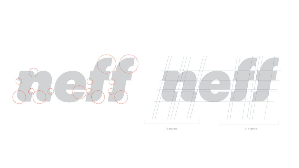
Finalizing the wordmark form wasn’t the end of the journey for this logo. What fun would it be without an icon sidekick? We didn’t want to sacrifice the bold impact of wordmark by putting an icon with it, so we needed one that could stand alone and represent the brand independently as a companion mark. This is where the new logo family in the Neff rebrand started taking shape.
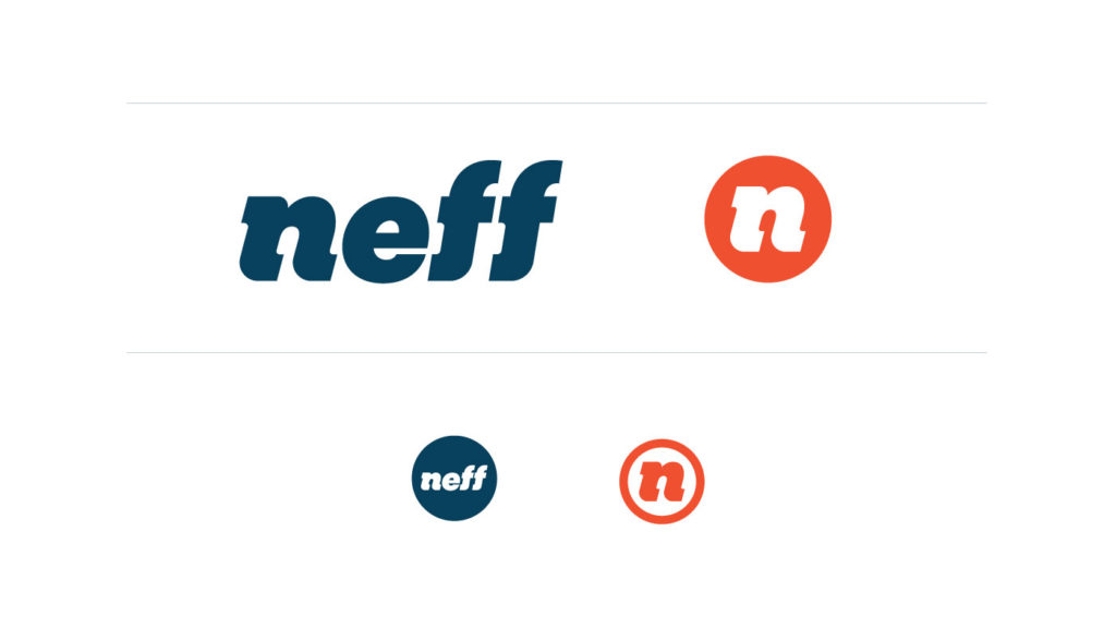
The next agency-wide debate was: go wild with the color or tone it down? As you can see, we compromised. We chose a blend of our classic navy blue and a new bright coral. And for the new color, we wanted to choose something that is loud, yet classy, and has strong character. To emphasize our services coming full circle, we blended the blue and the coral for shades to represent each service.
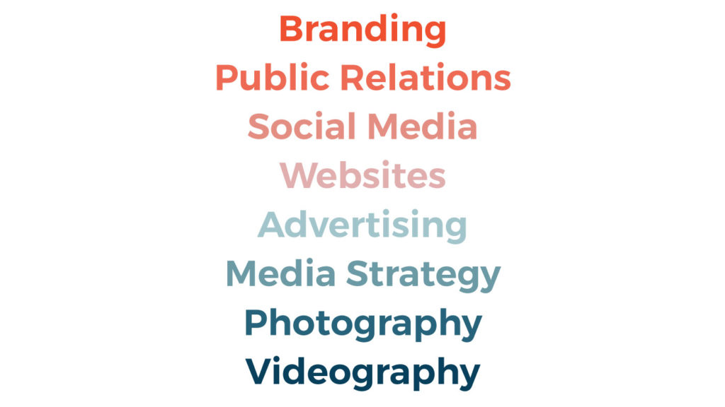
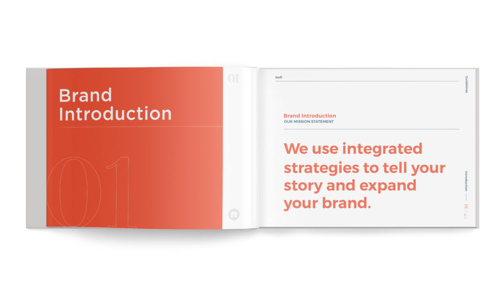
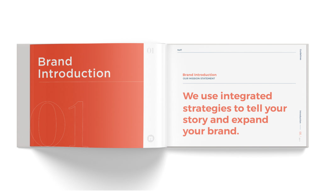
A new brand wouldn’t be complete without rules. Our design team poured countless hours into a 180-page guidelines document communicating how the Neff rebrand should and should not be used. The brand book covers all topics from stretching the logo to blog posts to T-shirt designs. It gives guidance on exactly what we can and can’t do. Our brand coral will never be printed as pumpkin orange, or Santa red, if we have anything to say about it!
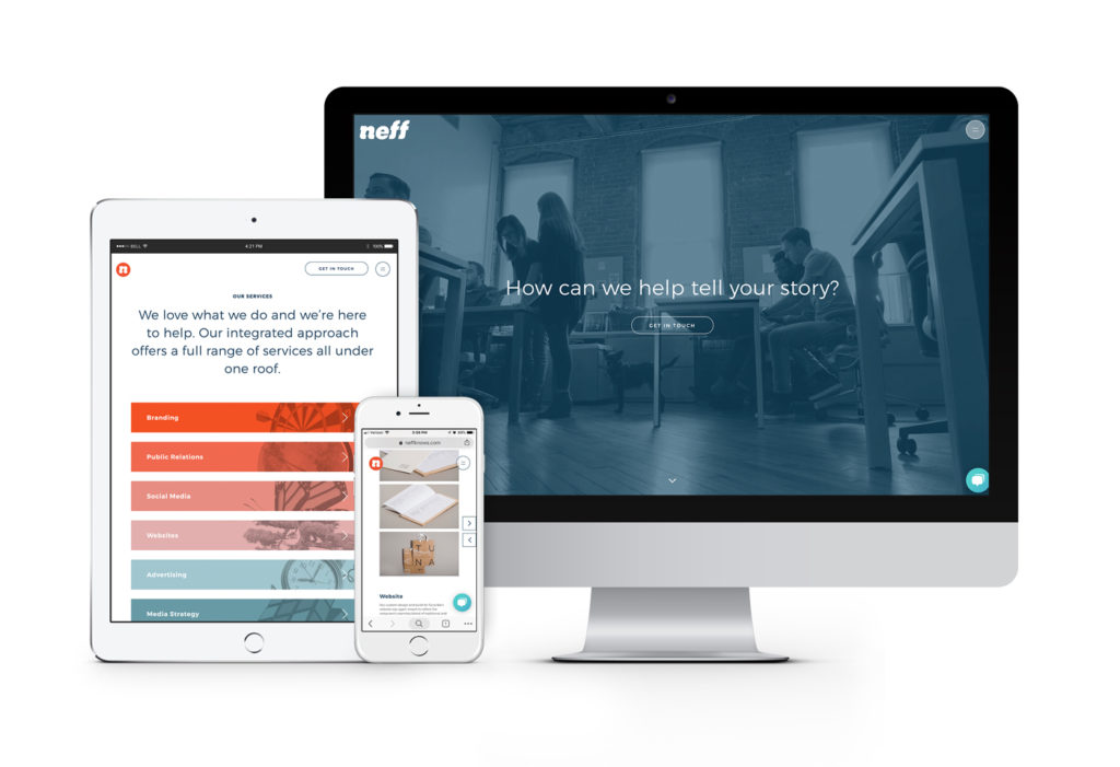
After the rebrand was complete, it was time to bring our new website to life. Content hierarchy was our first priority. Were we thoroughly communicating our capabilities to our audience? Was it immediately obvious how cool we are? It was time to shout to the world what we do it and how effectively we do it. Through an extensive research and architecture phase, we reconstructed the sitemap to create an intuitive experience.
To contrast our new bold brand, we chose a thin, concise font for our page headers and a minimalist type approach to the layout. Our main focus was showing how we help our clients communicate their brand through public relations, social media, branding, websites, advertising, media strategy, videography, and photography. Using eye-catching, yet understated graphics and a bold font to define our services, we let our portfolio do the rest of the heavy lifting.
Now that we had a new brand and a beautiful, updated website to show for it, it was time to let the world know. Through the efforts of our social media team, we launched the new @Neff_Knows campaign. Over the course of a two-day launch, our handles adopted our new tagline and our profiles got a facelift. Not only did we update our social media platforms on the surface, we are undergoing a complete social identity overhaul. With new social guidelines in place, our posts will have an updated, concise style. It reflect our new look and feel.
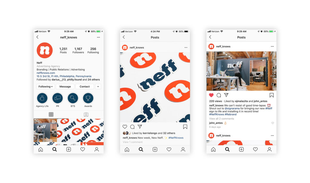
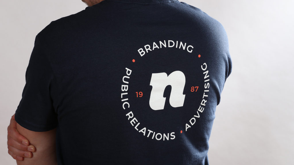
And how could we stop there with the re-branding fun? With no sign of “Associates” in sight, our office is now decked out with new signage and swag. There’s no shortage of newly brand Neff t-shirts, hats, pins, and stickers, and business cards to show off.
We’re excited to share our new brand with the you. We hope that it gives some insight into the creative, collaborative, innovative agency that we are. Also, we genuinely love helping our clients launch their brands and are thrilled to be able to give ourselves a makeover for the first time in thirty years. (Can we say case of the shoemaker’s child here?) For updates about the Neff rebrand and our clients, follow us on social media @neff_knows and sign up for our newsletter in the footer below.