 Get In Touch
 Get In Touch
With 260+ clubs spread across Pennsylvania, New Jersey and Delaware, the association works to preserve, protect, and promote the game of golf. GAP came to Neff to help rebrand them with a system that represents their longstanding history while driving the brand into the present and future with a more contemporary feel.
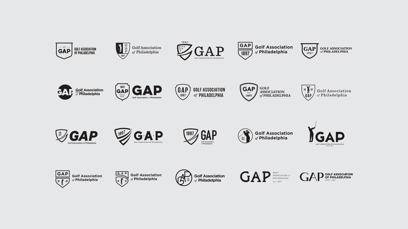
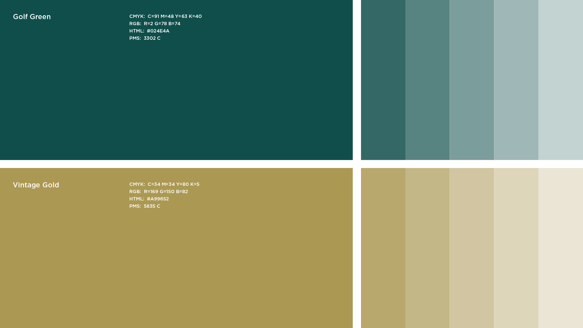
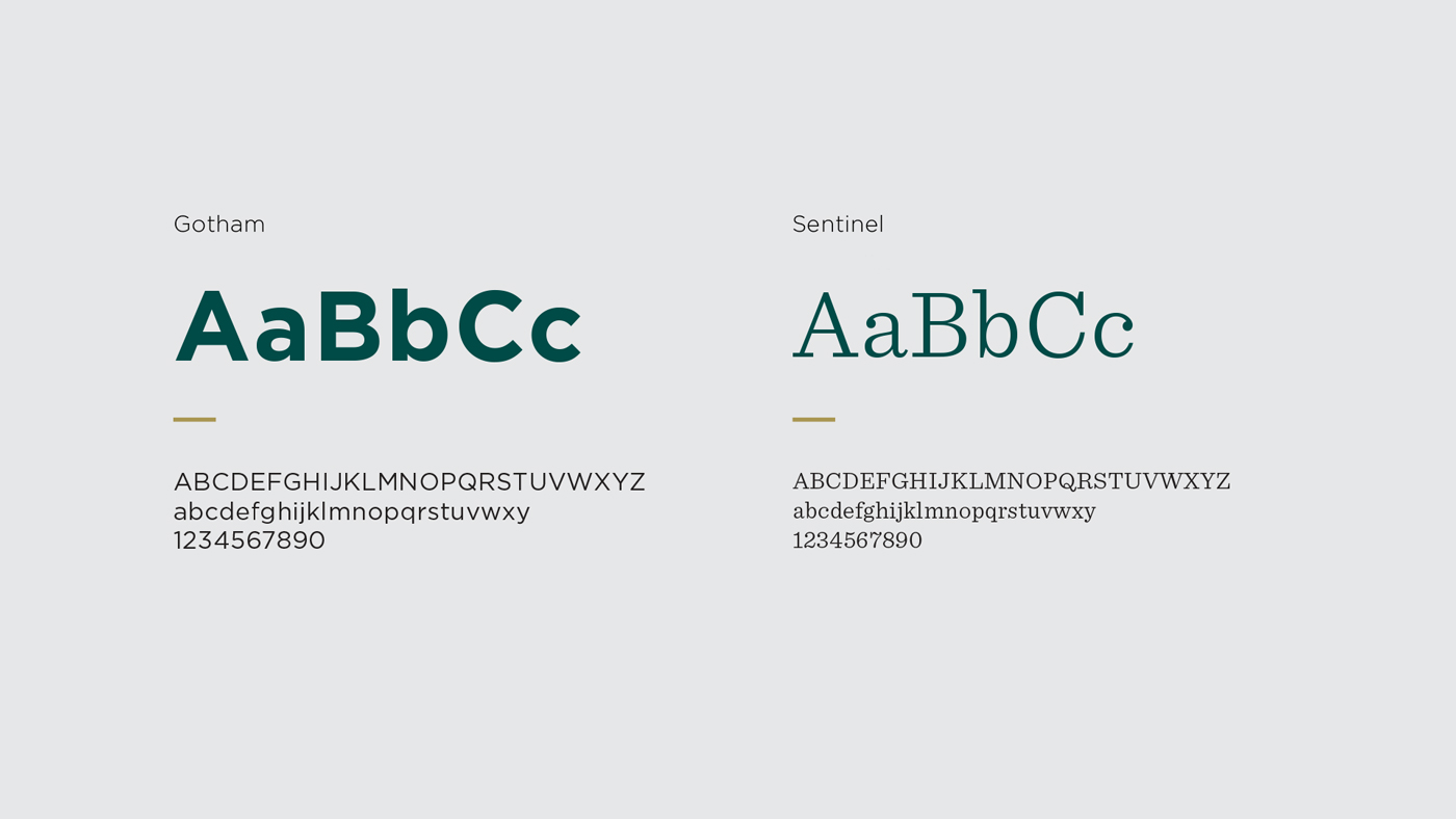
Our team collaborated with key association members at GAP to define a new brand and logo system that honors the past, specifically through their shied crest, while also moving the vision into the present day. For a more contemporary hybrid, we updated the color palette and typography, as well as introduced new iconography. The final result was a brand that is now scalable across web and all tournament collateral, as defined in their new brand guidelines document.

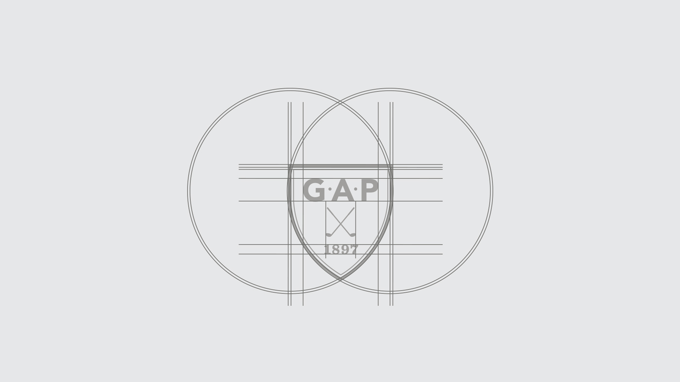
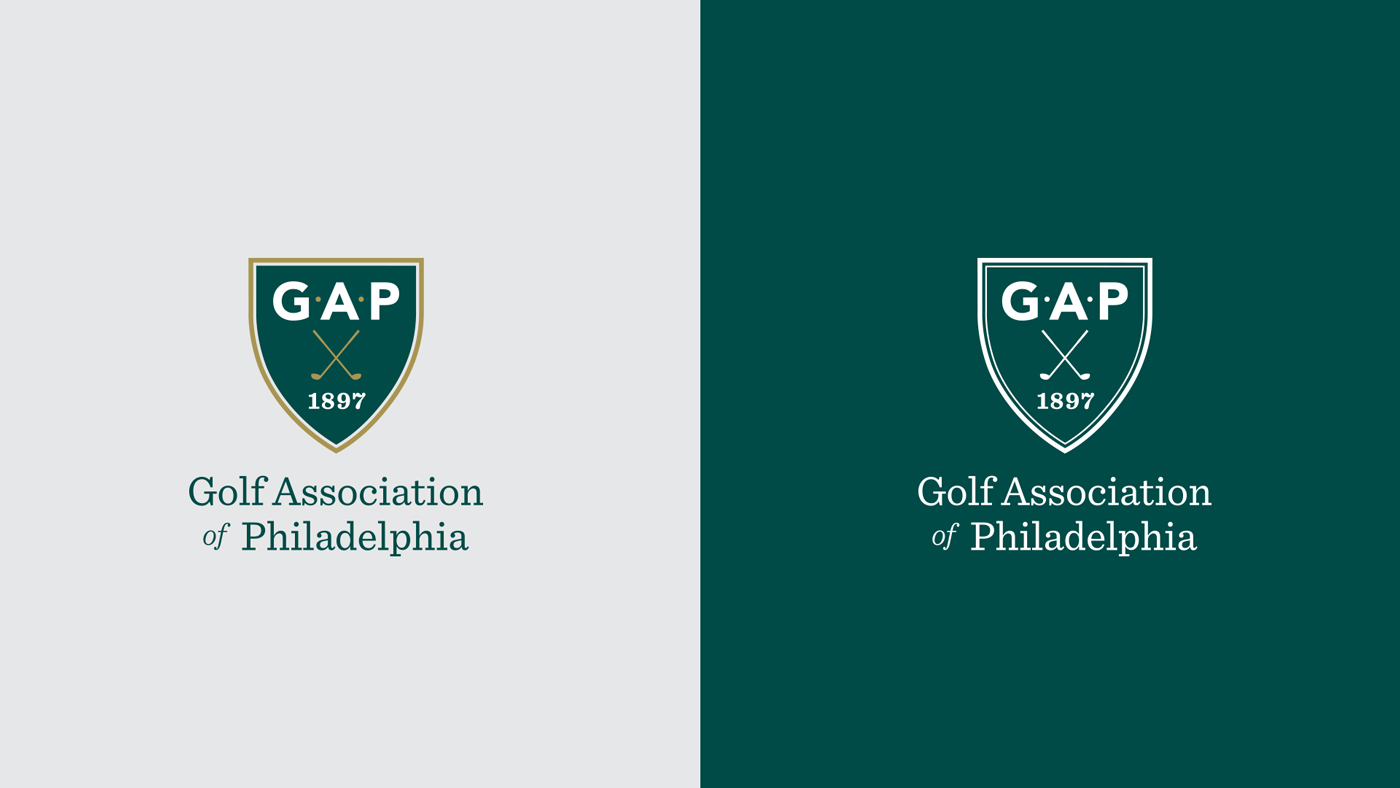
The updated GAP branding represents a balance of past, present and future while also solidifying the organization’s place in the community. The mark features a contemporary, custom sans serif lettering for “GAP” with dots separating the letters to demonstrate the acronym. This is paired with a more contemporary serif for “1897” and “Golf Association of Philadelphia” for a combination of old and new. The shield shape is an updated reference to the history of the previous design, and custom drawn golf clubs add contrast and a clear visual reference to the sport. The ongoing balance between traditional and contemporary directs the new logo down a path of clean, sophisticated timelessness.
GAP Branding Video from Neff.
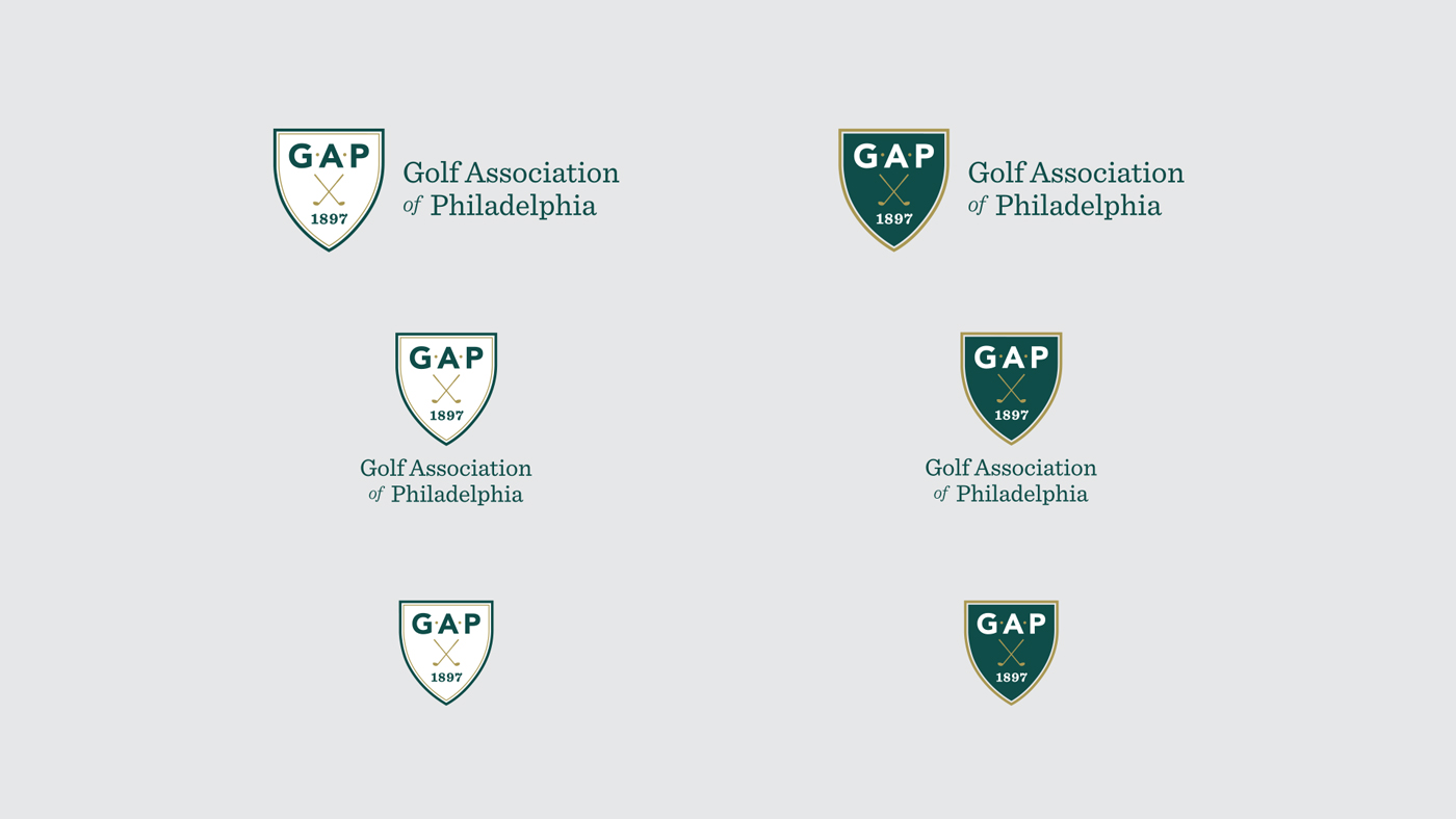
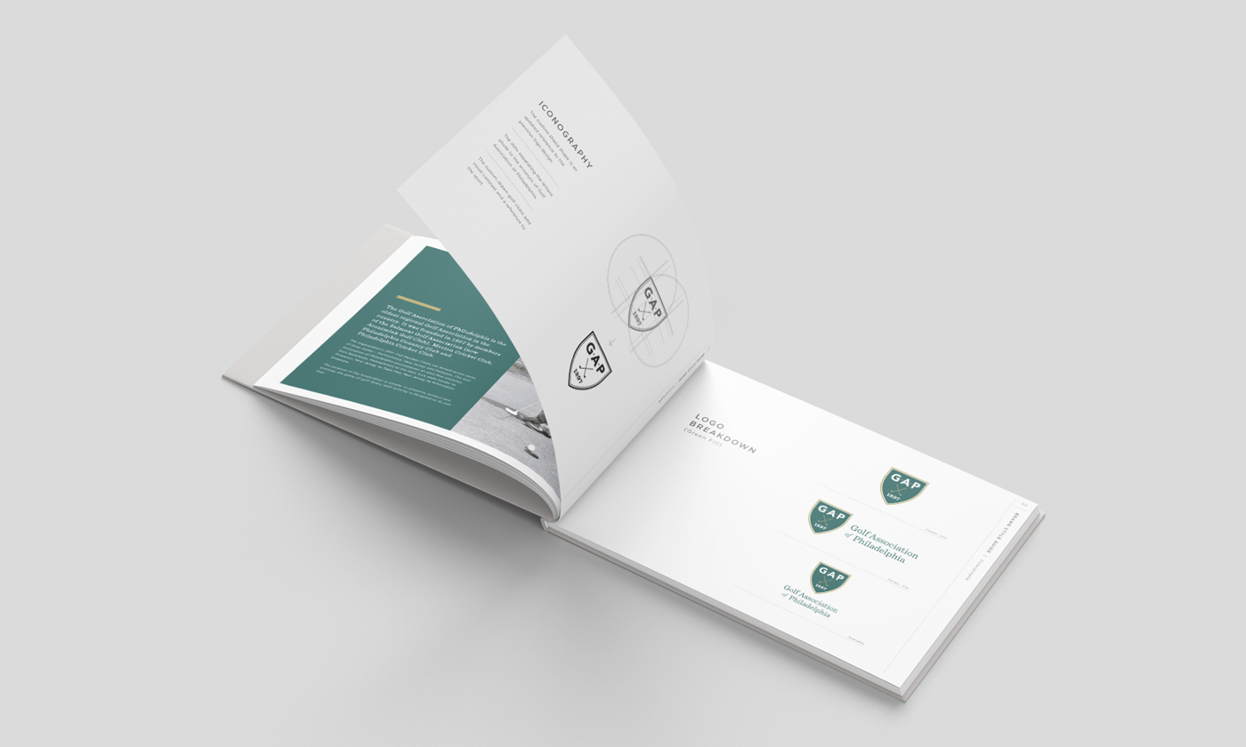
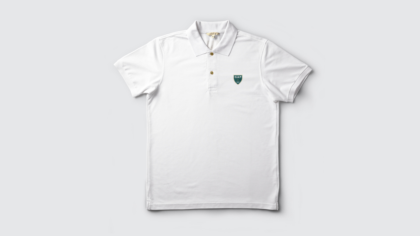
The new brand set is defined for GAP in a detailed Brand Guidelines document that details how, and how not, to use the assets moving forward. From shirts to online to tournament signage, there a many scenarios the must be defined and outlined for the association.

Photography by Neff and Golf Association of Philadelphia