GAP
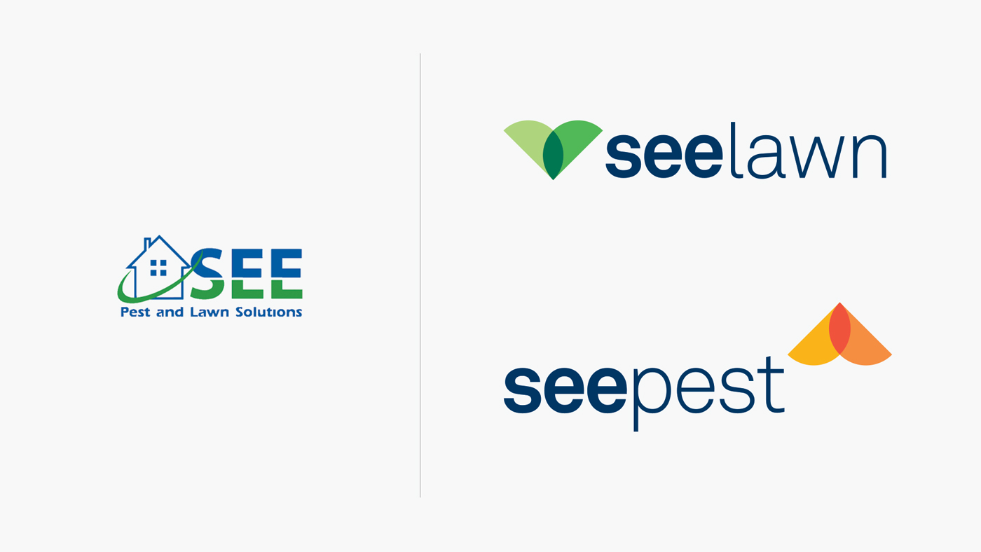
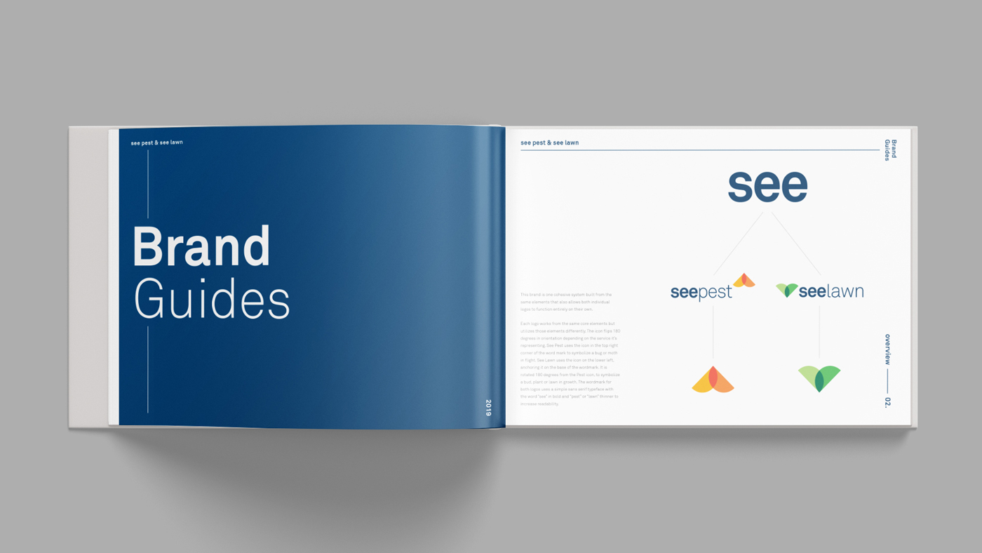
SEE Pest & Lawn approached Neff in 2019 for a brand redesign. The company needed an updated look in order to stand out in a large market of pest control and lawn care companies. Additionally, SEE was looking to develop separate logo identities for the pest and lawn services, while maintaining an overall cohesion.
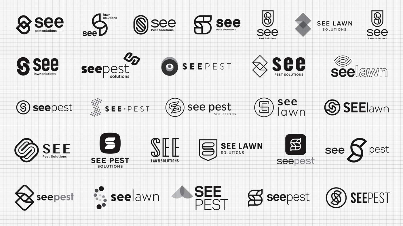
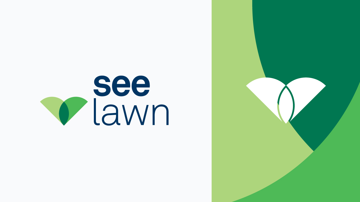
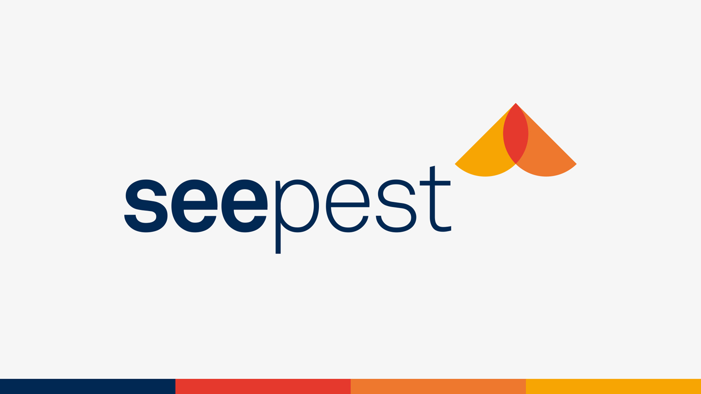
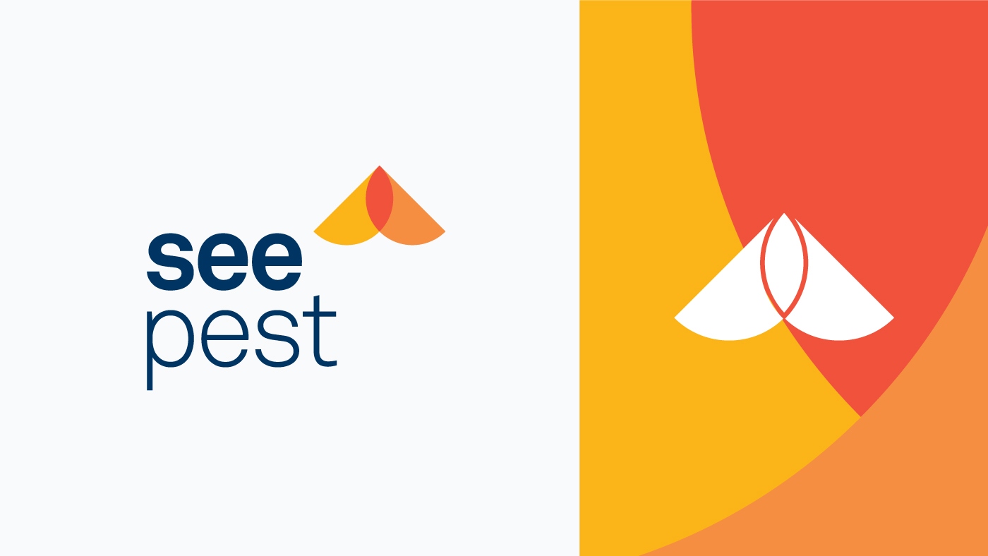
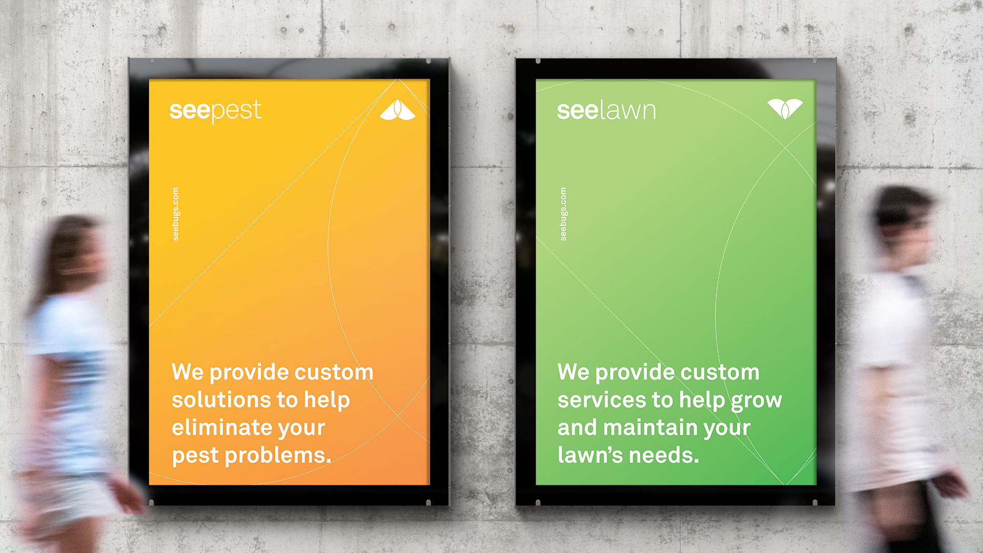
We collaborated to help simplify and update SEE’s brand into two unique business marks that also function as part of the larger set. Each logo works from the same core elements but utilizes those elements differently. The icon flips 180 degrees in orientation depending on the service it’s representing.
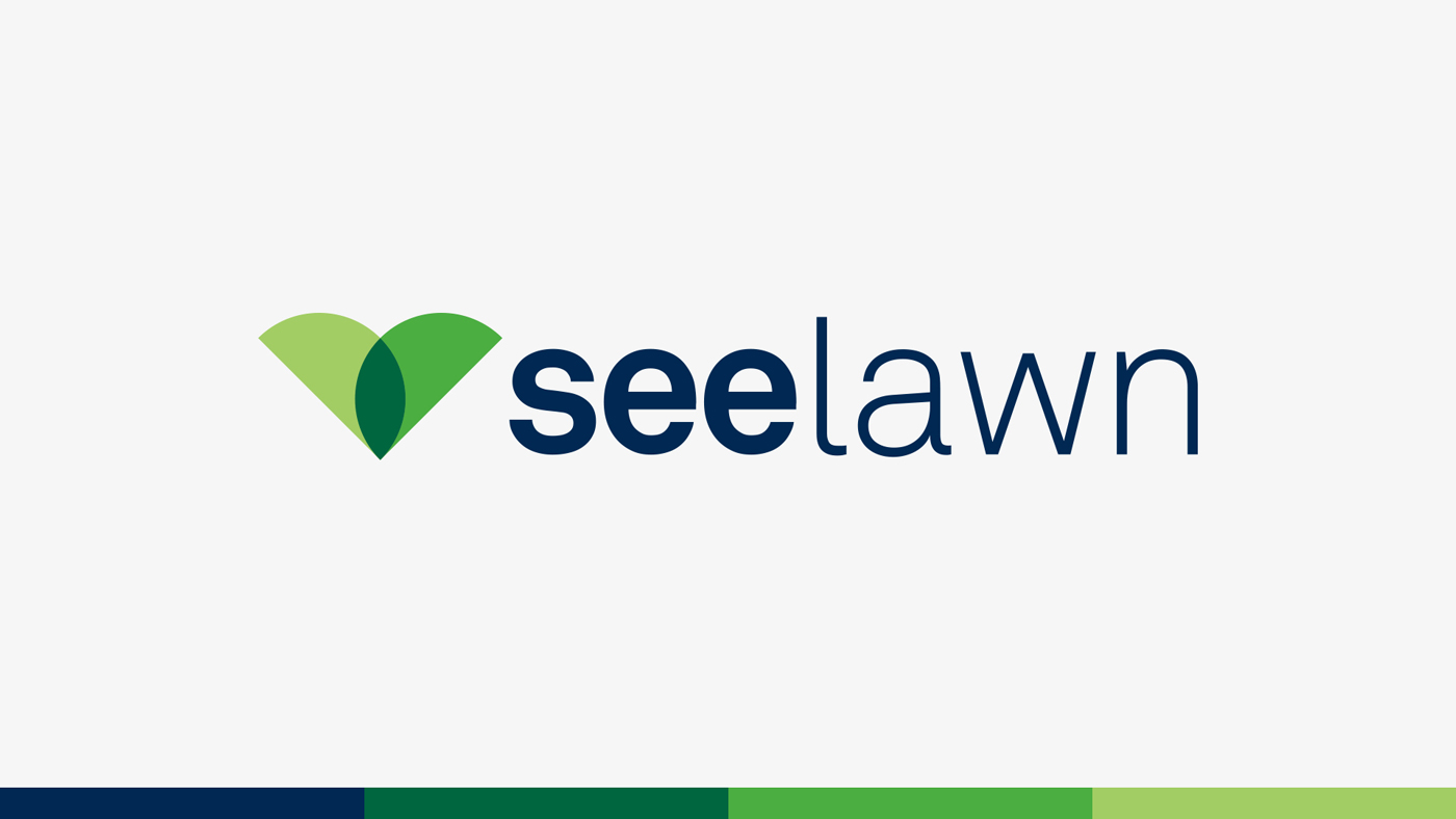
See Pest uses the icon in the top right corner of the word mark to symbolize a bug or moth in flight. See Lawn uses the icon on the lower left, anchoring it on the base of the wordmark. It is rotated 180 degrees from the Pest icon, to symbolize a bud, plant or lawn in growth. The wordmark for both logos uses a simple sans serif typeface with the word “see” in bold and “pest” or “lawn” thinner to increase readability.
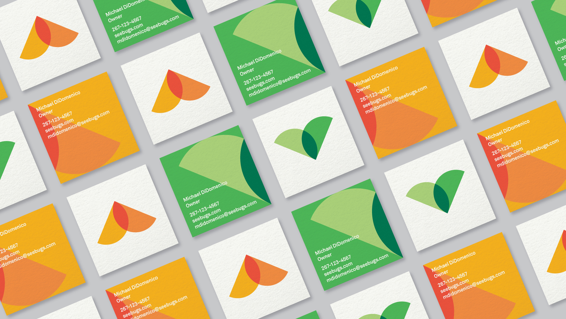
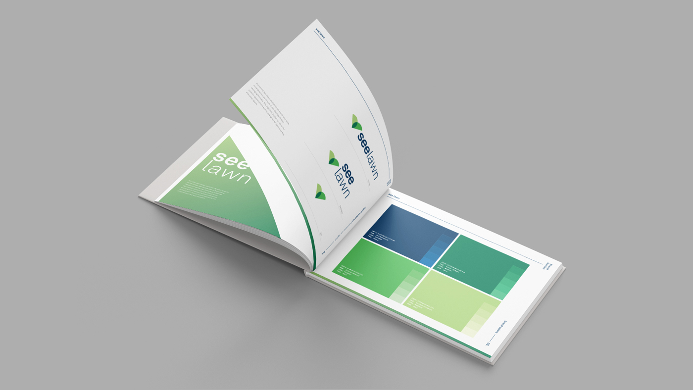
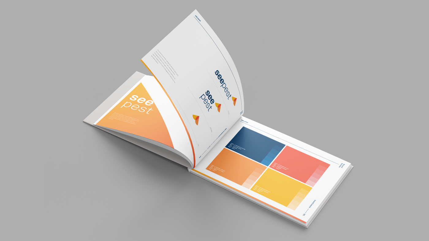
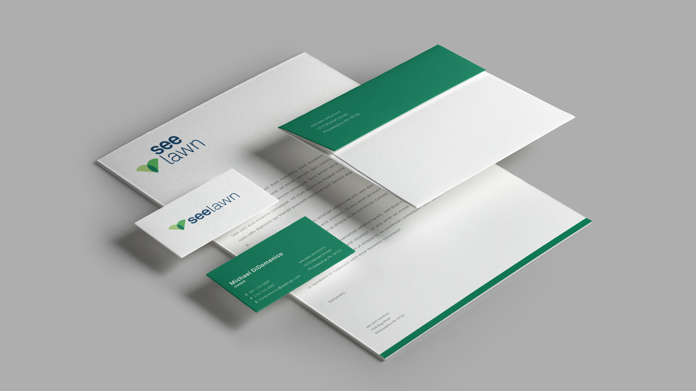
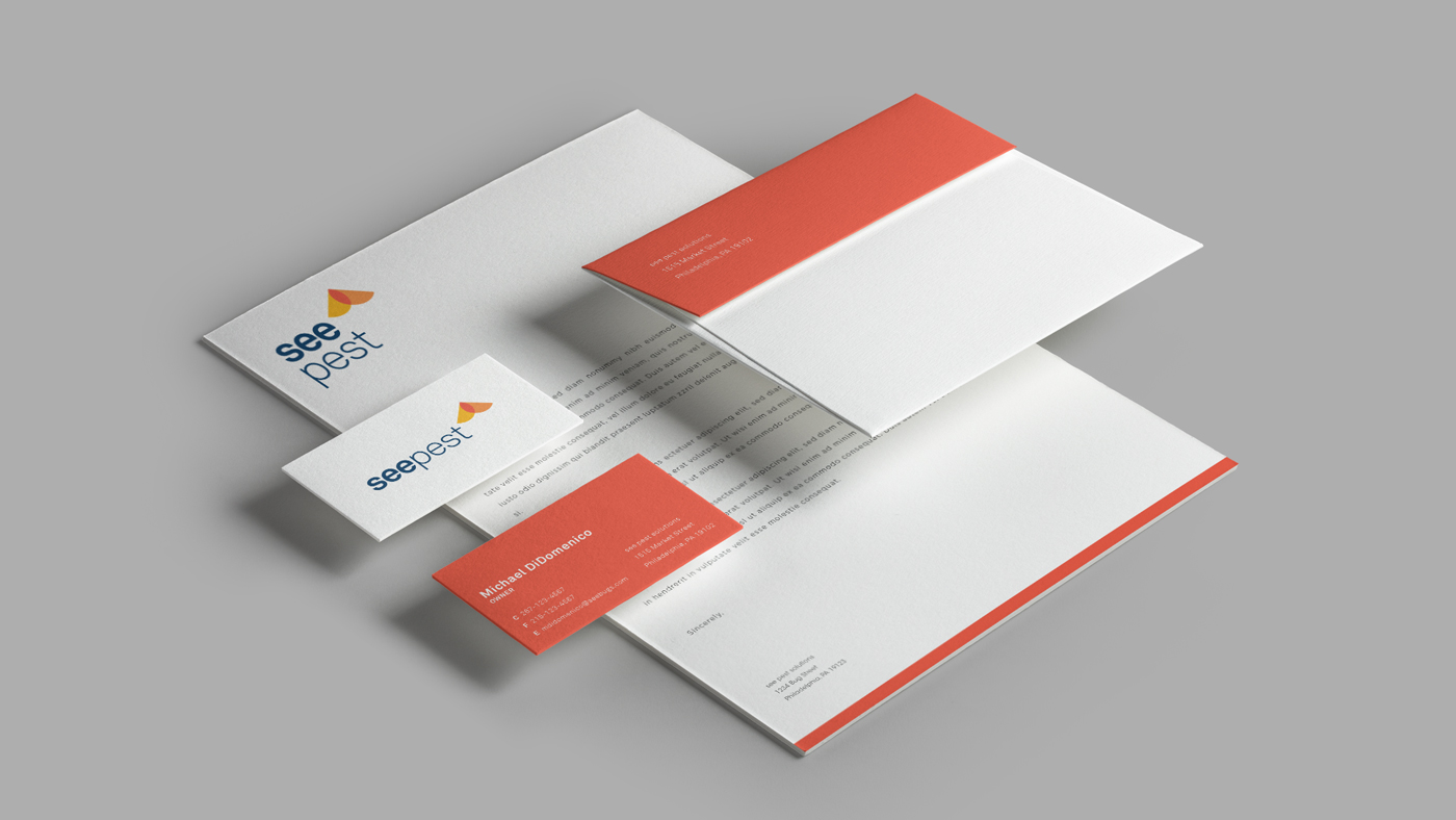
We defined the new look in a set of brand guidelines and applied the updated branding to stationary, business cards, and outdoor advertising.
Photography by Neff