Tuna Bar
Artisan’s Cellar hired Neff to create a unique, modern identity that would also honor their tradition and stand the test of time. With a focus on B2B commerce, Artisan’s provides kegged wines to restaurants and bars to be served on tap. Representing the artisans and their craft was the highest priority for the brand, while also representing the modern kegged wine process.
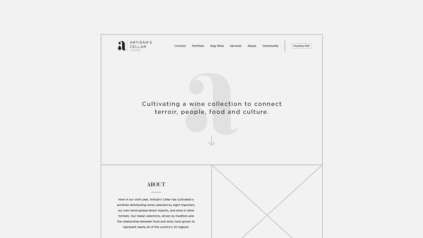
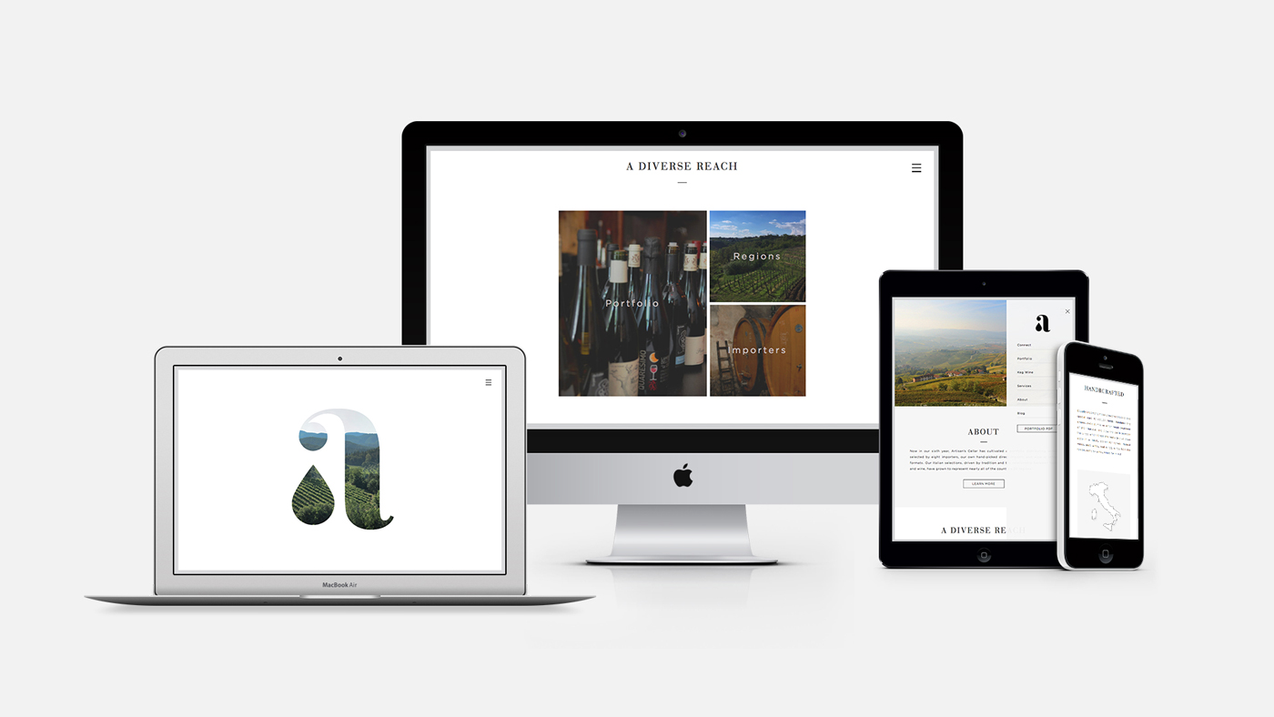
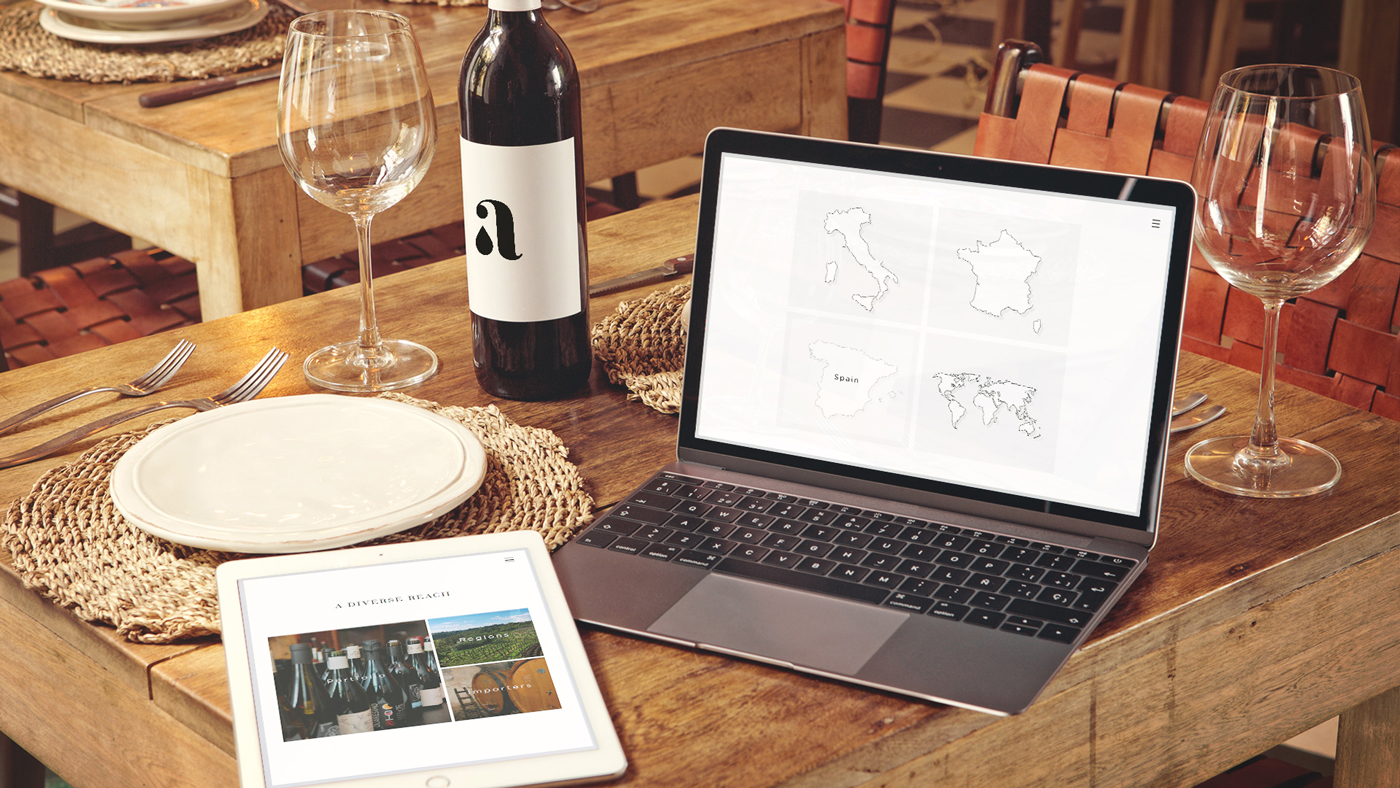
Given full creative license, Neff conducted a brand redesign that started with extensive research into the process of making and kegging wine to fully understand the business. During the process, we interviewed a variety of stakeholders including wine connoisseurs, restaurant owners, and vineyard workers and looked into numerous approaches to be sure we found the best possible solution. The brand was then carried into a modern, clean website designed and developed by our web team.
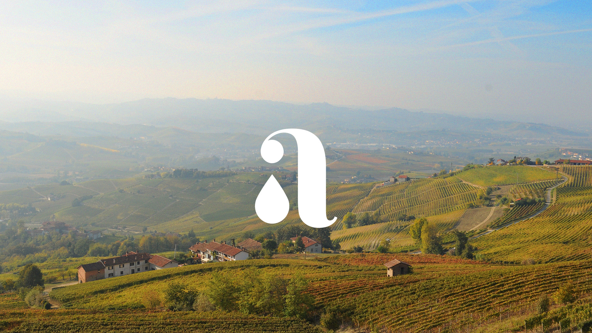
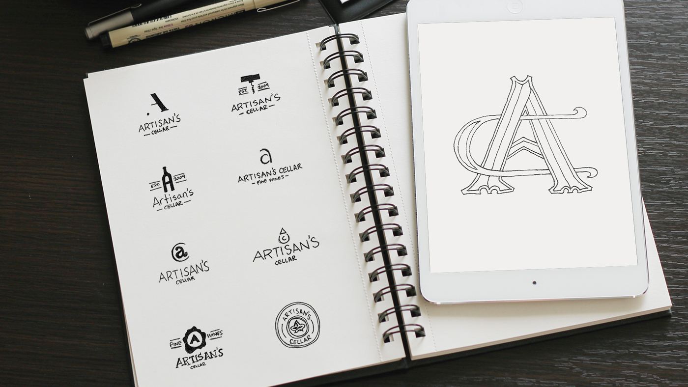
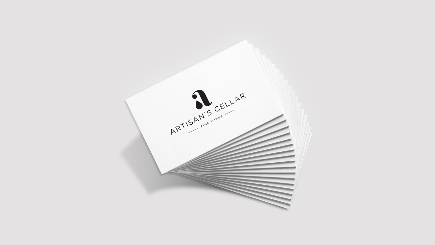
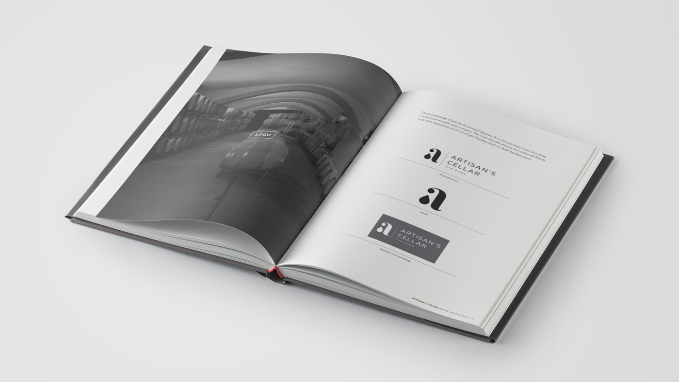
Our team drafted hundreds of logos during development, and ultimately landed on one that represented both the idea of the wine coming from a tap, but also the artisans themselves. The icon is a modern “a,” with a wine droplet as the bowl and a simple sans serif font for the wordmark. The deliberate, more utilitarian font choice was meant to help draw more focus to the icon.
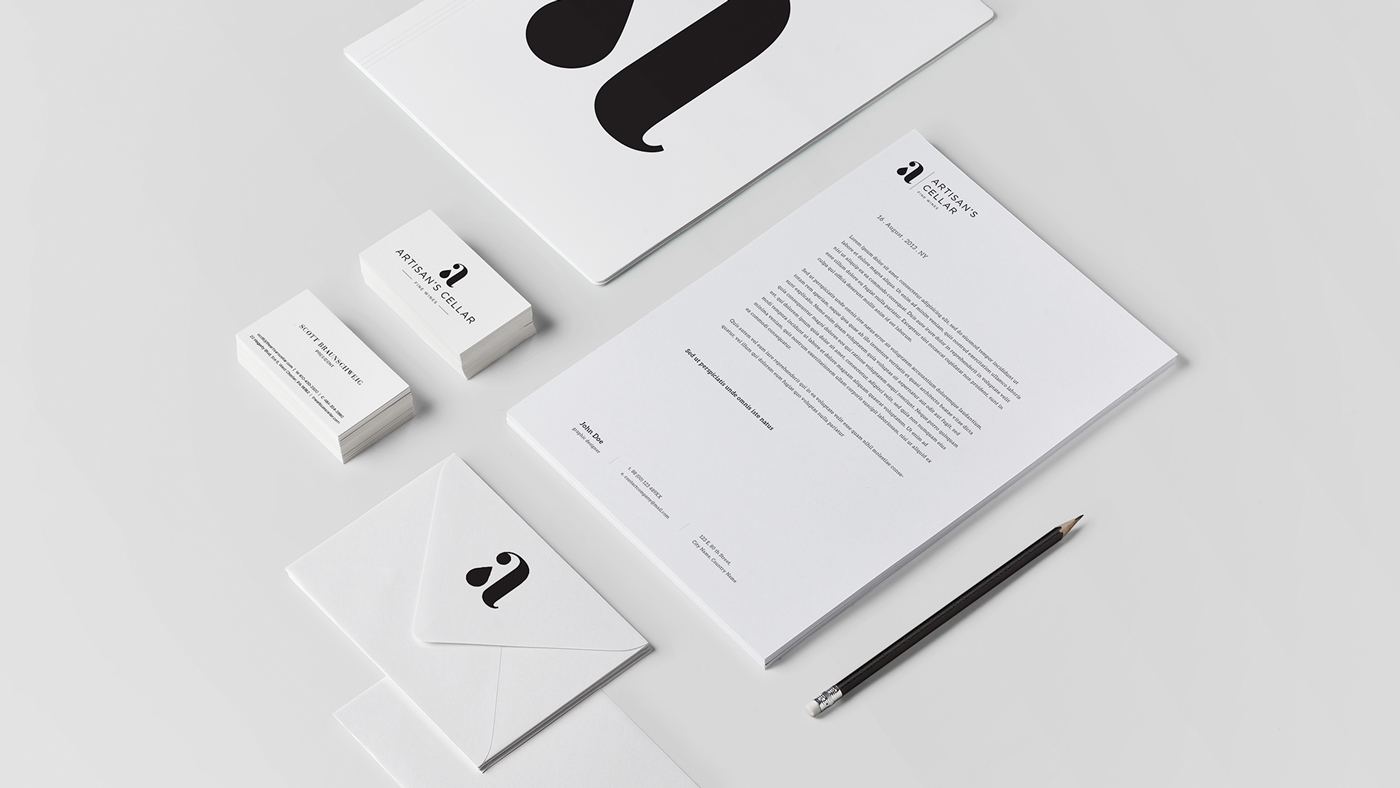
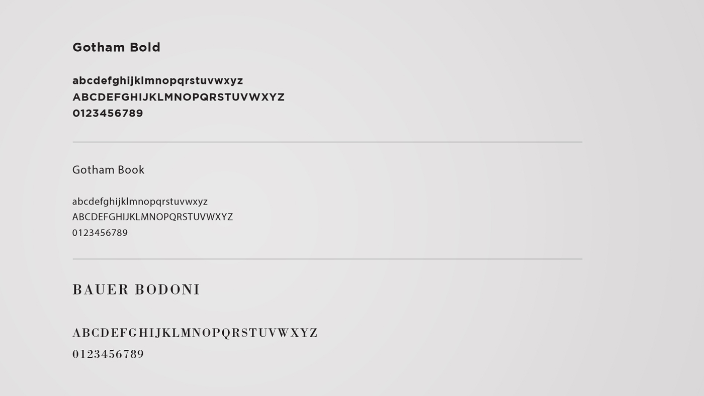
The brand was developed using minimal color and imagery to maintain focus on the simplicity and elegance of the logo structure. The brand goal was to represent the wine artisans in a modern, clean structure. Color was intentionally omitted from the core identity and only used in photographs on the website. This distinction was detailed in our comprehensive brand guidelines documents provided to the client. Additionally, our team created a letterpress business card, letterhead, and envelope to capture the brand’s beauty and simplicity.

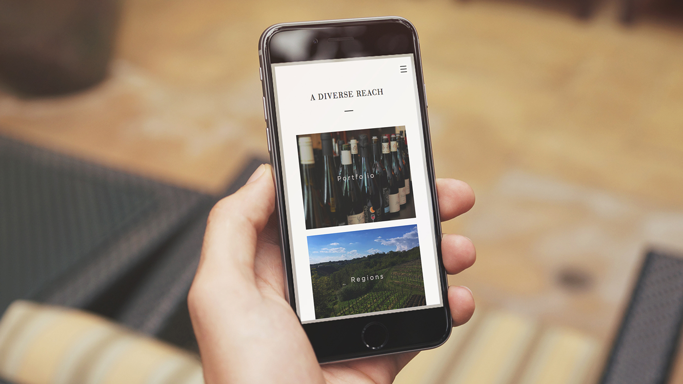
The website was designed to reflect the modern, simplistic approach to the brand. The only instance of color within the whole brand appears in photography on the website. To compliment the minimalist layout of the website, we designed effects and interactions in every corner, leaving no part of the website feeling static.
Artisan's Cellar from Neff

Photography by Neff and Artisan's Cellar