October 18, 2013
Article by neffknows_admin

Responsive Design: Getting a Grip in a Fluid Layout World

responsive-web-design

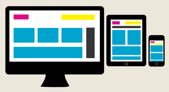
A few years ago, something changed in the way we view media: Apple released the first generation of it’s now ubiquitous iPhone.  The internet instantly transformed from something you could only view from your desktop or laptop computers (or  for the few elite, in a horribly rendered 150 x 150px screen on your Blackberry) into a completely new medium where users had all the power.   Not only do websites in todays world have to be have beautiful graphics, sleek layouts, and intuitive navigation, but designers now how to answer these same questions from screen sizes as wide as 2560px all the way down to the smallest 320px smartphone.  So what’s a girl to do, you ask?

  1.  Go Vertical:  As your screen size gets smaller, elements that make sense side by side on bigger screen sizes should stack on top of one another to maximize readability.
  2. Prioritize content.  When screen space gets smaller, so should your content.  Get rid of extraneous sidebars, search forms, and asides so users won’t have to scroll through unnecessary content to get to their destination.
  3. Rethink navigation:  Don’t squeeze the same kind of vertical or horizontal navigation you loved on your desktop site  into your mobile.  Try slide-aways, fold-outs, and drop-downs as a means of adding navigation without taking up your entire on-screen real estate.
  4. Think Fast:  People will be using your mobile site when they are on the go.  Don’t make your users sit through long load times,  extraneous information, and long scrolling  before they find what they need on your site.  Keep things short and sweet, and use CSS to point to smaller images with shorter load times when a user is going mobile.