 Get In Touch
 Get In Touch
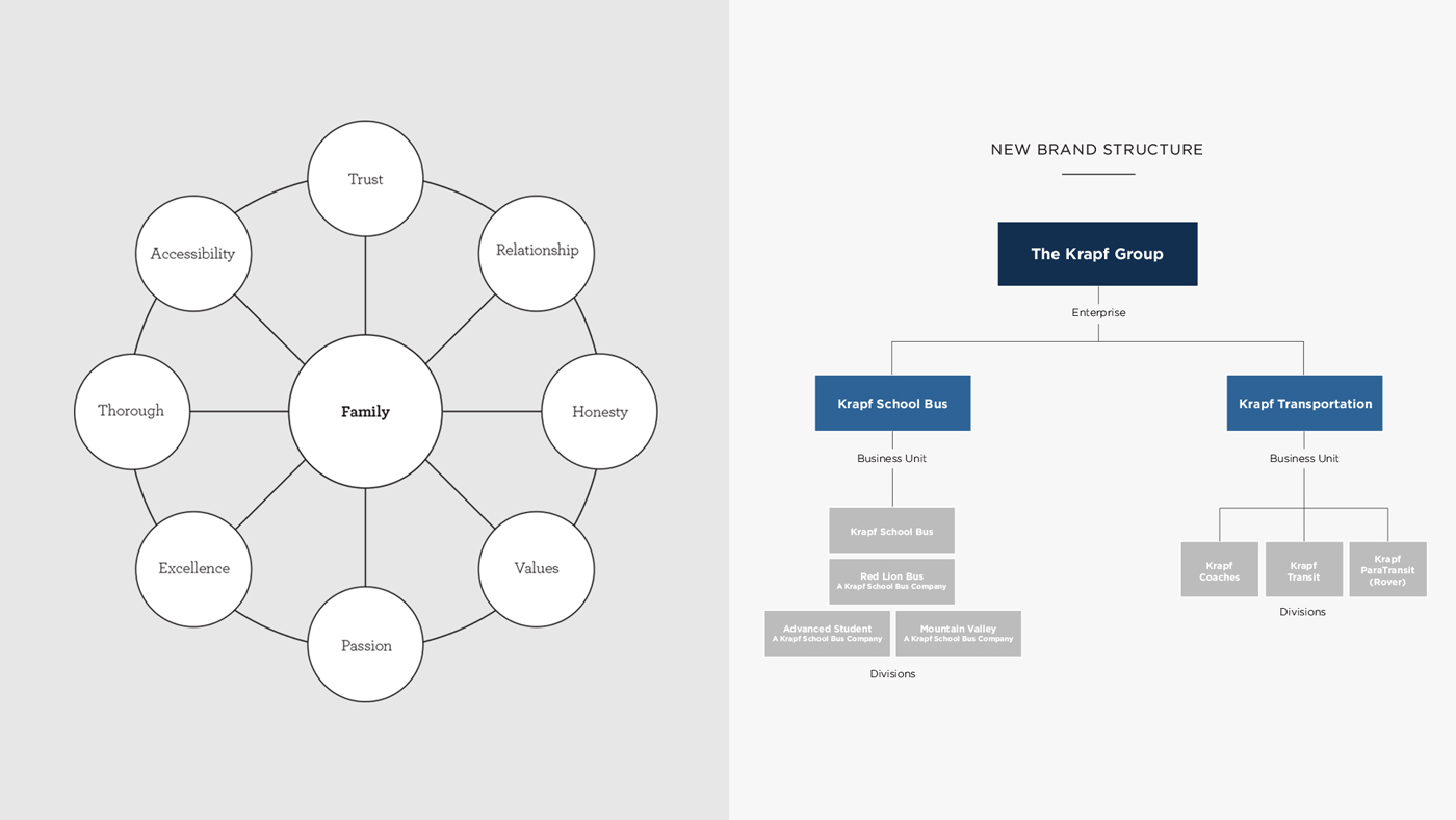
The Krapf Bus Company was in need of a complete brand restructuring and overhaul when they approached Neff in early 2017. From day one of our partnership, the goal was to help define who they are as an organization, where they were going, and how they are going to get there. The Krapf name and business has a 75-year tradition of quality and family values, but the company lacked a consistent brand message, aesthetic and structure.
The newly structured brand identity and guidelines gave Krapf an opportunity to open communication both internally and externally by implementing the new brand across their divisions. The success was measured initially in their increased levels of communication with themselves and their customers. This success then extended into Krapf’s ability to implement new brand elements and marketing, under their own accord, that felt consistent under the new parameters. Most importantly, they are now set up to more efficiently recruit drivers.

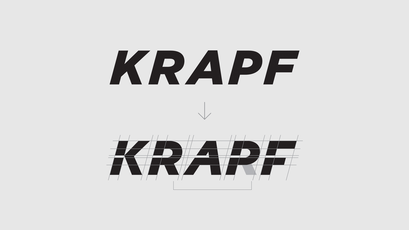
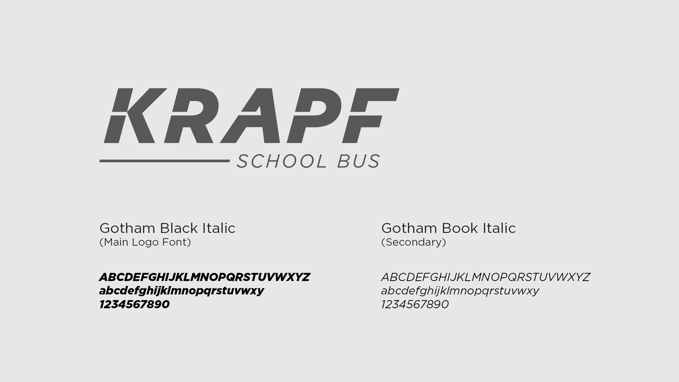
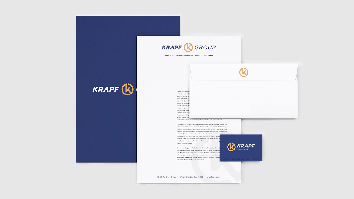
Primary and secondary logos were designed for each division of the company. The word mark is based in the root font Gotham Black Italic. The italic was used to create a sense of movement. The root font was modified with a custom “through-line” to connect all characters and emphasize the forward movement and family connection through the Krapf name.
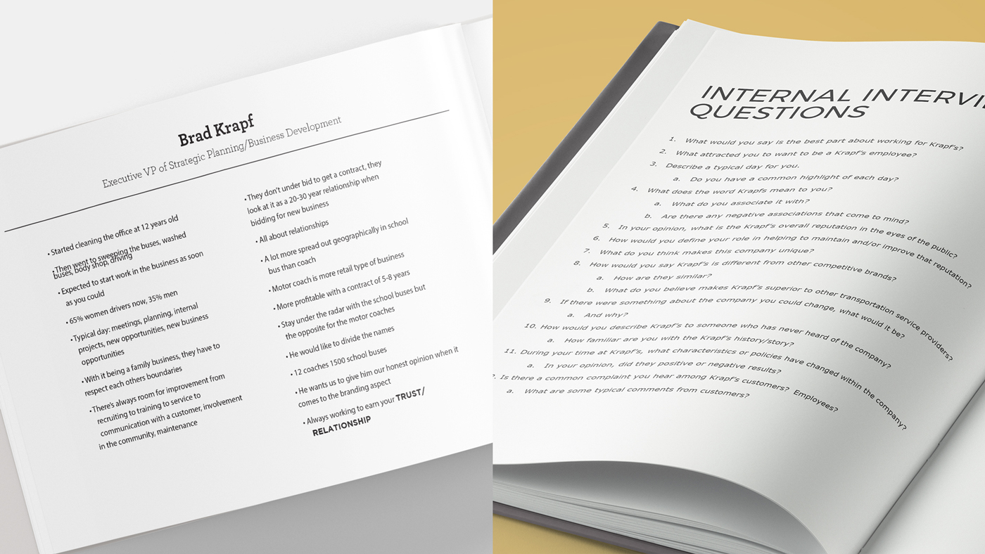
Neff Associates conducted an in-depth branding process that included intensive research and interviewing, brand re-structuring, logo design for each company division and a website to provide one cohesive, yet unique hub for both School Bus and Transportation.


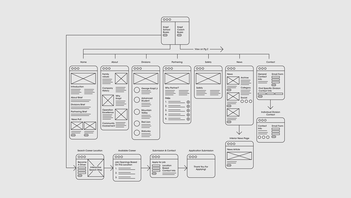
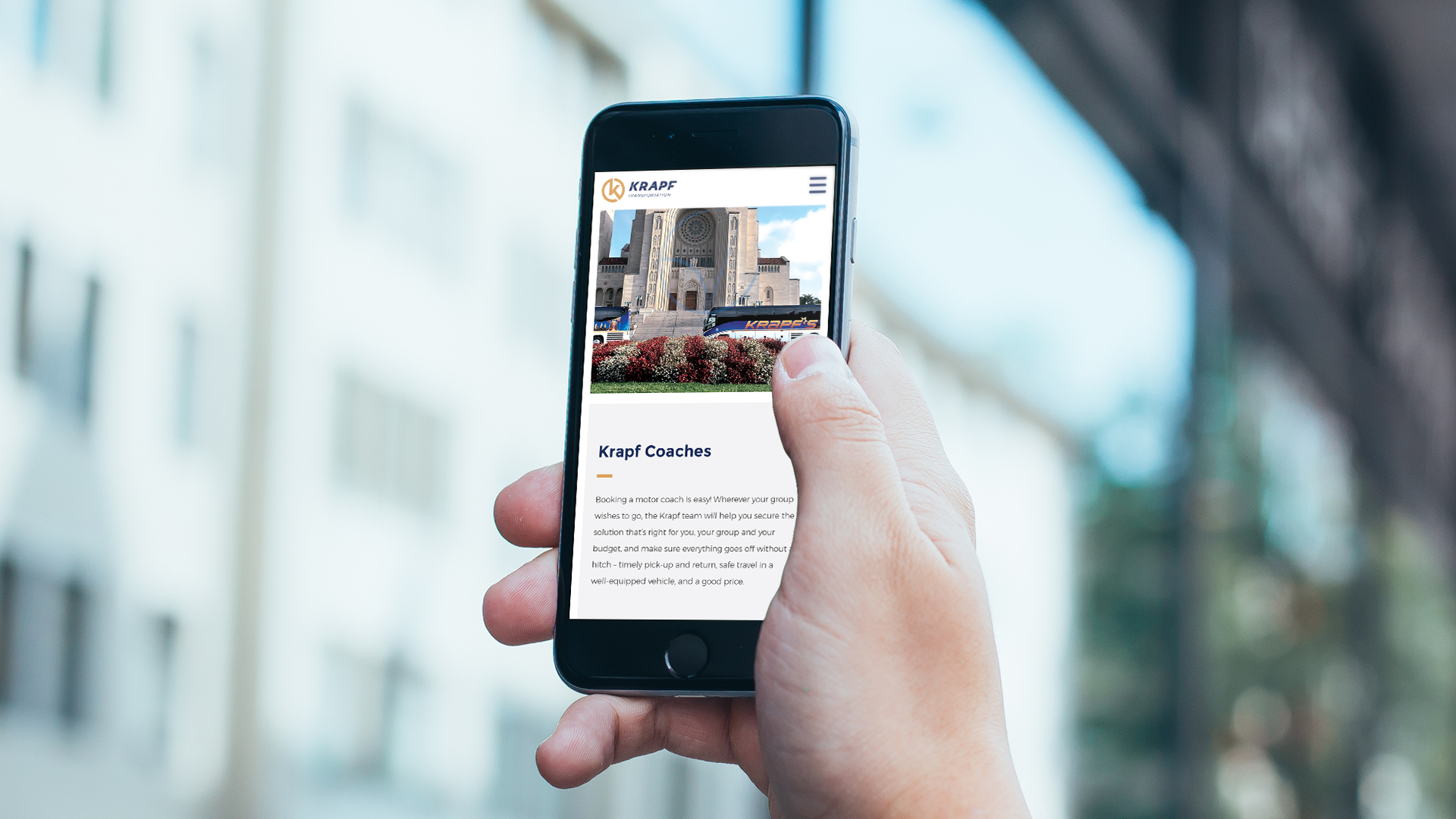
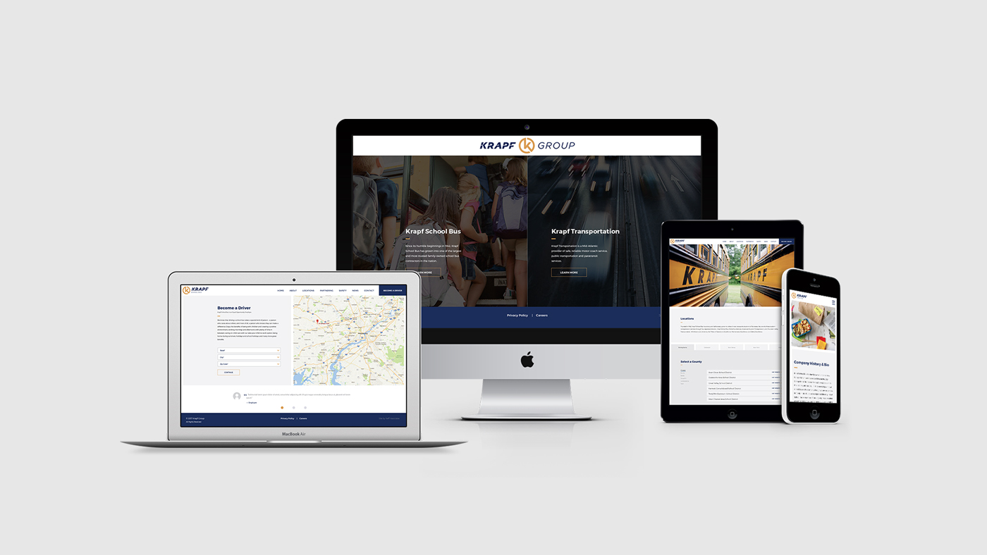
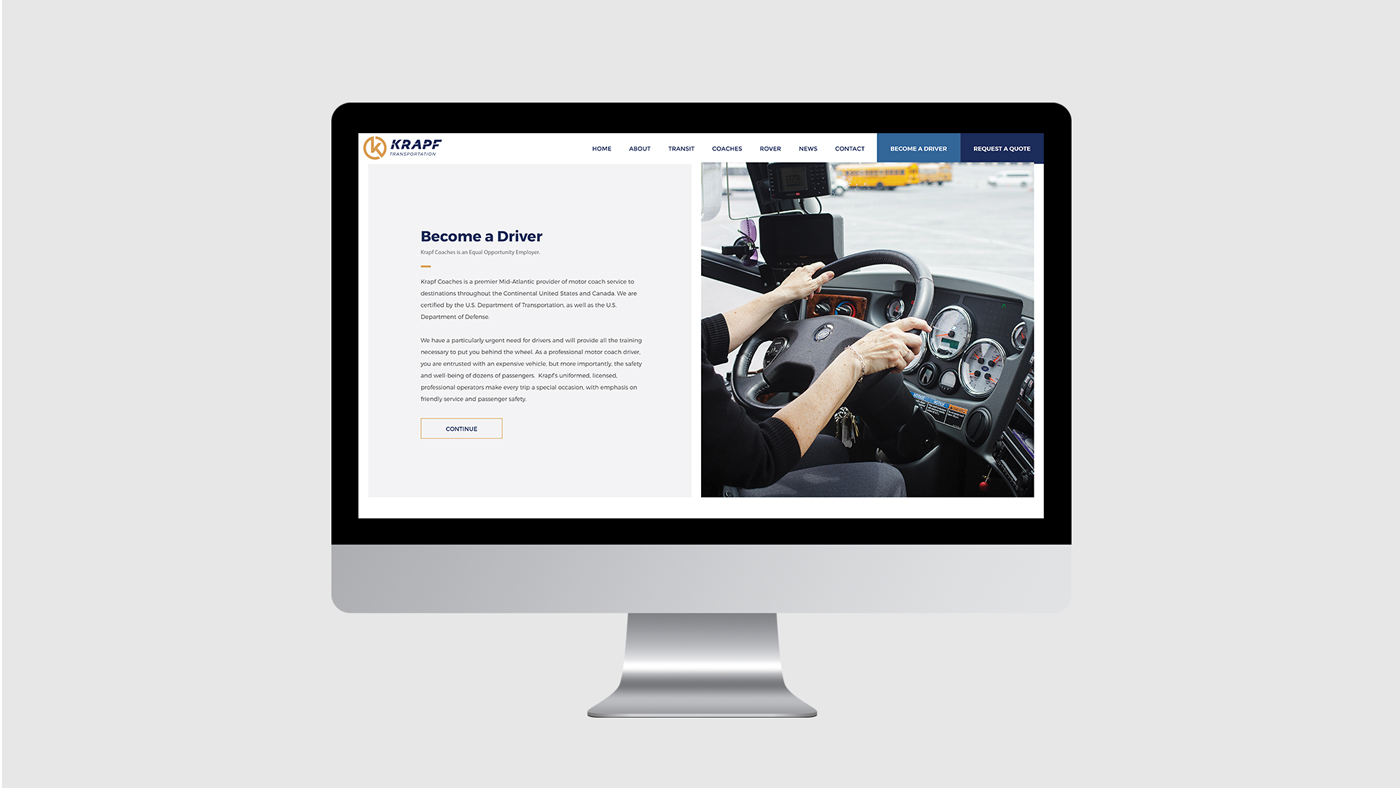
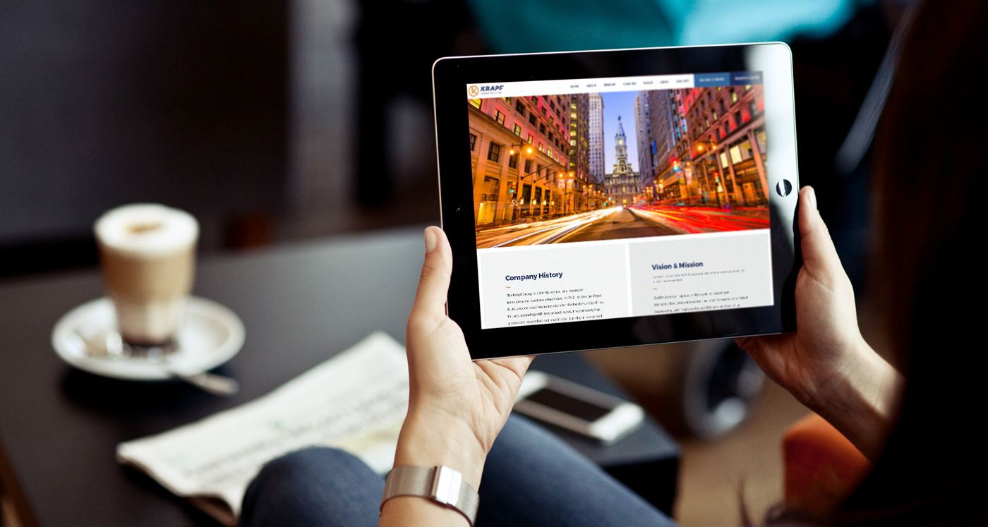
Our team redesigned and developed the Krapf website for both sides of the business, Krapf School Bus and Krapf Transportation using a two-part fundamental design to emphasize the new brand structure. A key function of the website is geotargeting driver applicants to streamline the application process so different divisions across the region receive qualified, relevant applicants.
Photography by Neff and Krapf Group