Lincoln Square
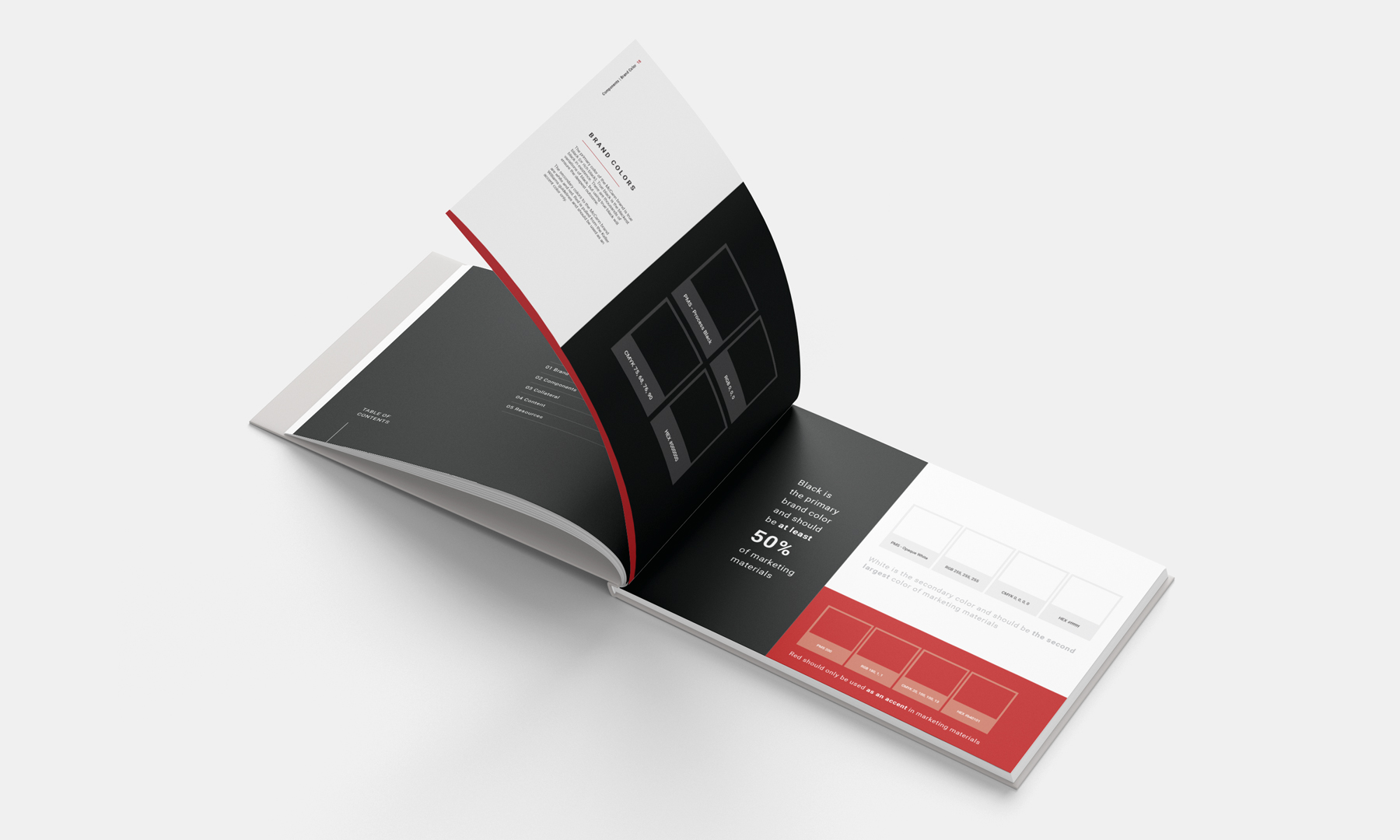
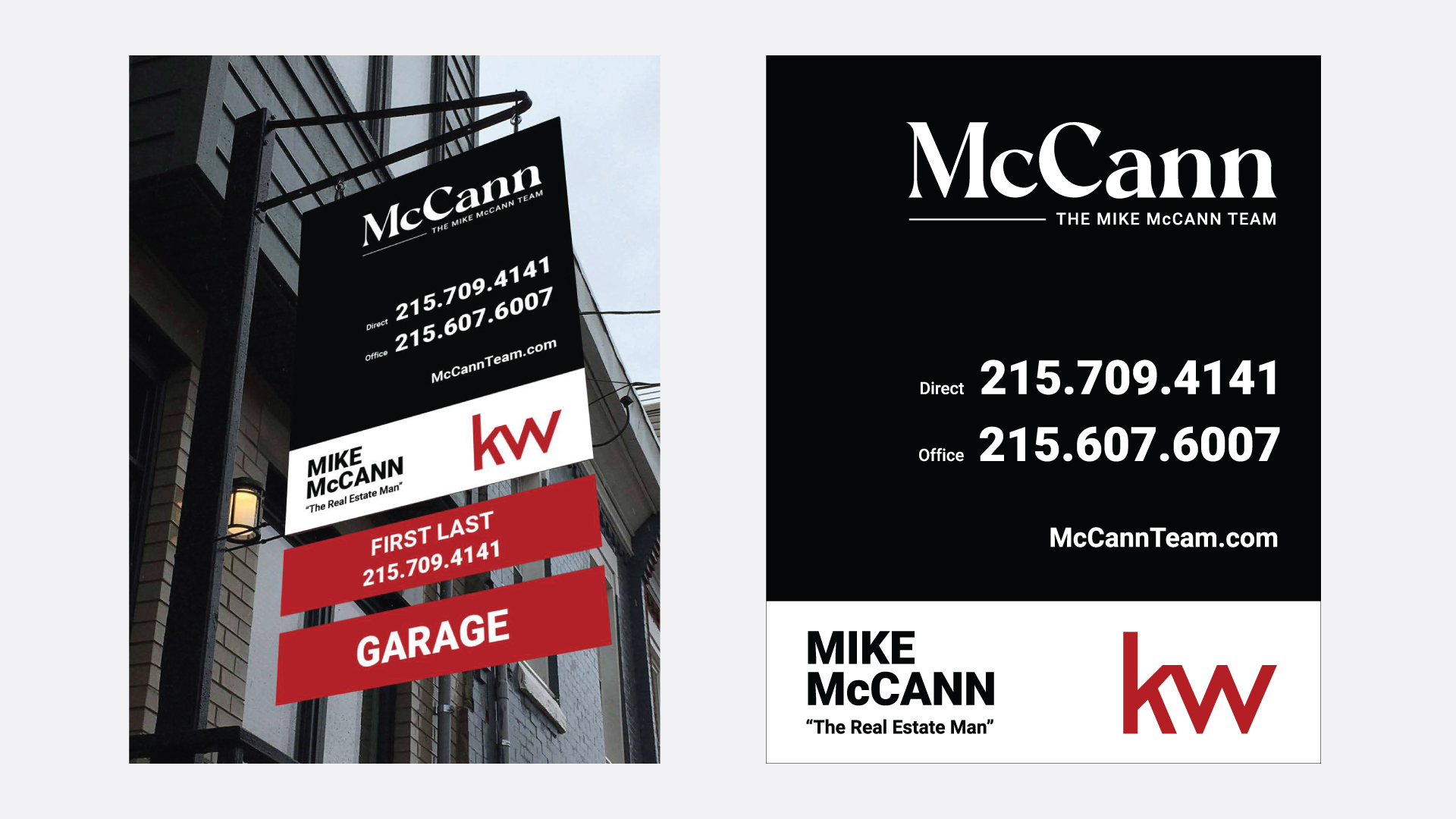
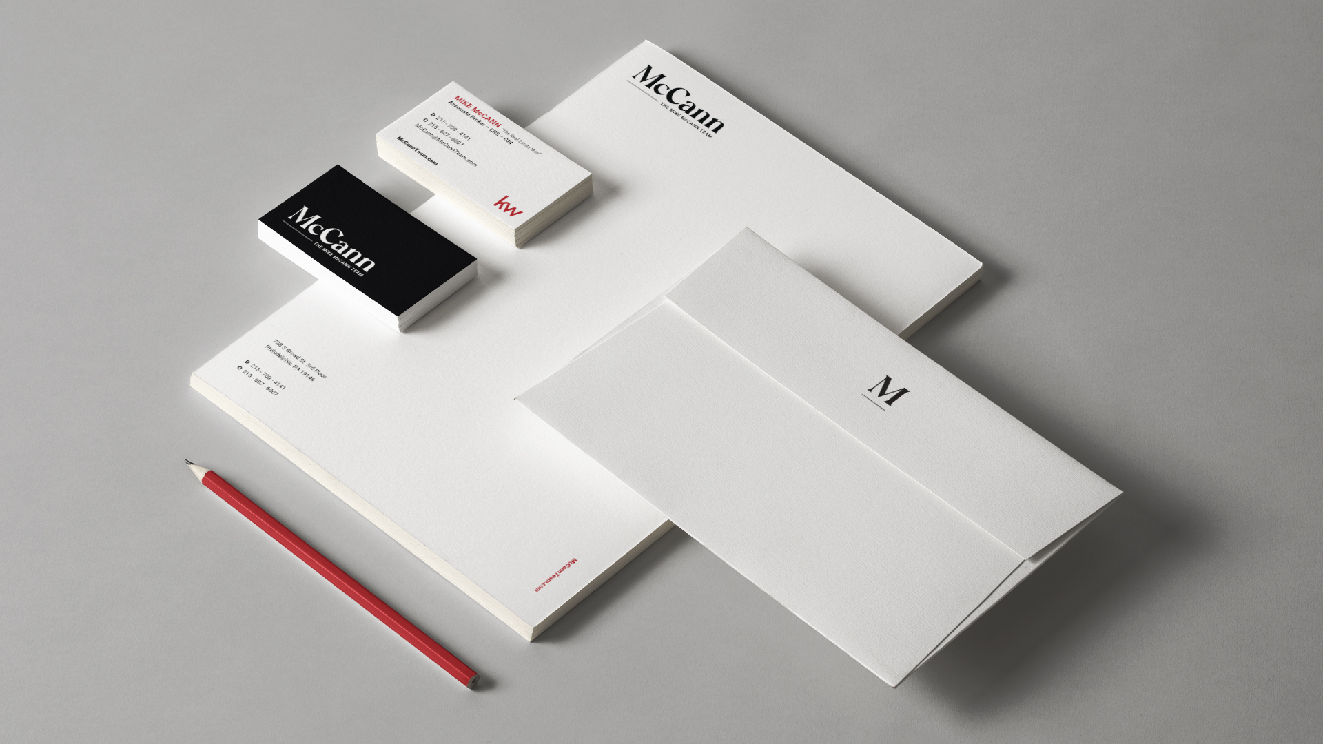
McCann, previously known as “The Mike McCann Team,” set out to refresh their brand and simplify their message. The team needed a name that functioned as a logical next step in their 30 year evolution, as well as a brand system that would connect with a modern audience. To accompany their new logo, all collateral materials required a redesign in order to spread brand awareness and a cohesive message throughout Philadelphia and beyond. Additionally, one of the primary goals for the brand update was to compliment and coexist with the KW parent company.
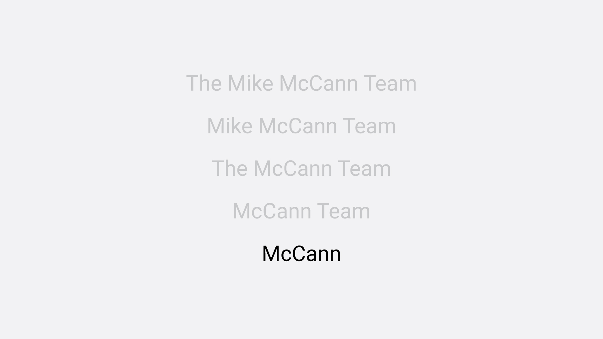
Neff worked with Mike McCann and his team throughout the naming process and landed upon a classic, simple next step of “McCann.” To create a smooth transition for clients, we kept the tagline “The Mike McCann Team” in the primary logo, in a way that is easily removable as the brand progresses through its transition. We designed a timeless, contemporary logo system, modern brand elements and a new brand guidelines document that also complies with the parent system for KW.
Neff and McCann worked together to brainstorm a name that could best represent a modernized brand. Our goal was to select a name that felt trustworthy and credible, something that would still be recognizable for the well-established McCann brand, but would also take the company into a more contemporary style.
After multiple rounds of logo exploration and refining the mark, the McCann team chose a clean and classic direction for their brand. This classic wordmark is both eye-catching and timeless. Using the font “Carphe” as our base, we customized it by emphasizing the flares at the base of the word for a sturdier foundation while reducing the flares on each “c” and the “a” for better stability and readability. We also sharpened the middle of the “M” and tops of each “n” for a more modern, clean look.
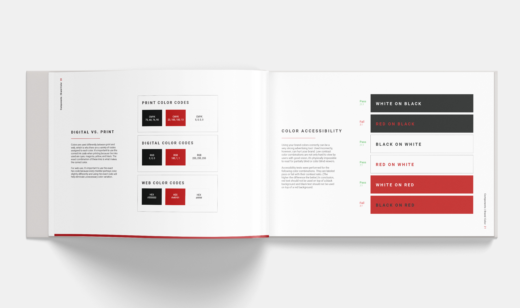
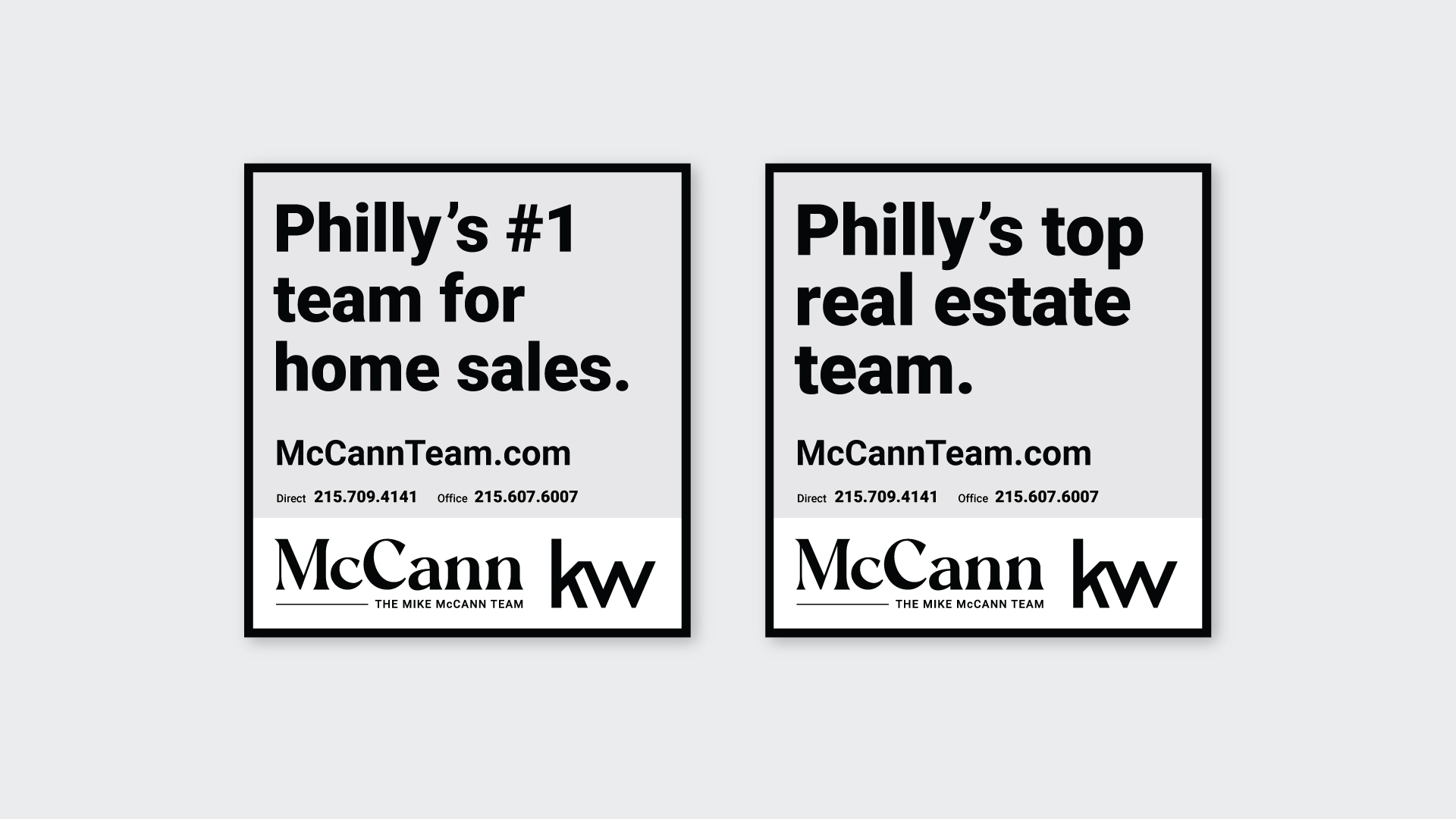
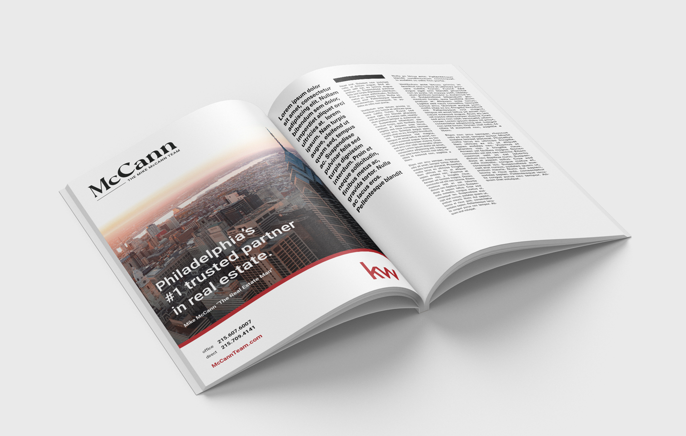
Using the new brand elements, we also created brand signage, business cards, corporate identity elements, and digital agent banners. The challenge with this brand was coordinating with the Keller Williams brand guidelines to ensure we weren’t breaking any parent brand rules in our designs.
Photography by Neff and McCann