 Get In Touch
 Get In Touch
Peter Zimmerman Architects is a residential design firm located on Philadelphia’s Main Line. Known for their superior custom designs, the firm needed updated branding that would capture the high quality of their work. PZA came to Neff for both a new look and an updated website to combine their traditional style with a modern user experience.
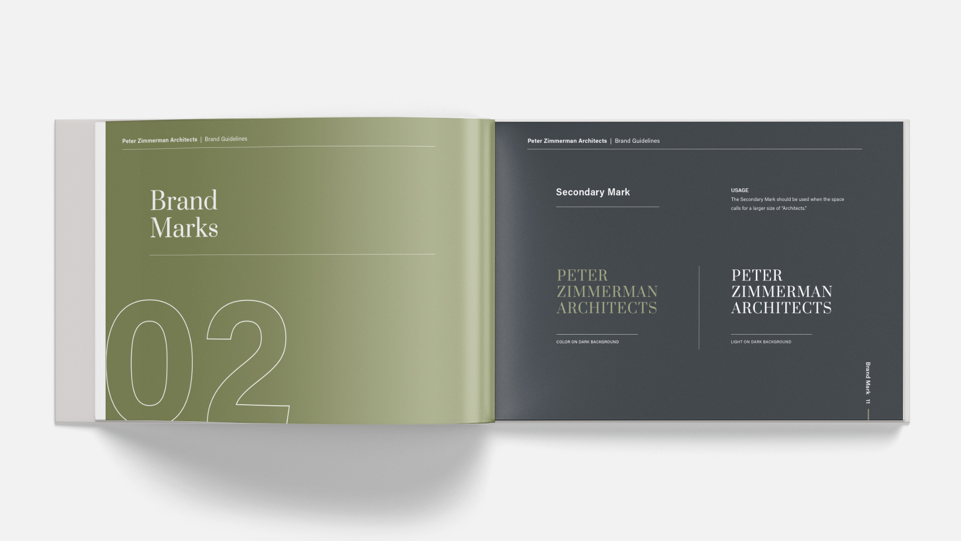
We worked closely with the PZA team to develop a new brand rooted in their particular philosophy and style. Our team referenced historic architectural traditions of proportion and scale when designing the new look, which captures firm’s elegance in the context of readability and a responsive website.

In developing ideas for the new logo, we started from principles of classical design and based our sketches on the proportions of the golden ratio. We wanted to ensure that every detail would correspond with the firm’s philosophy and fine tuned approach.
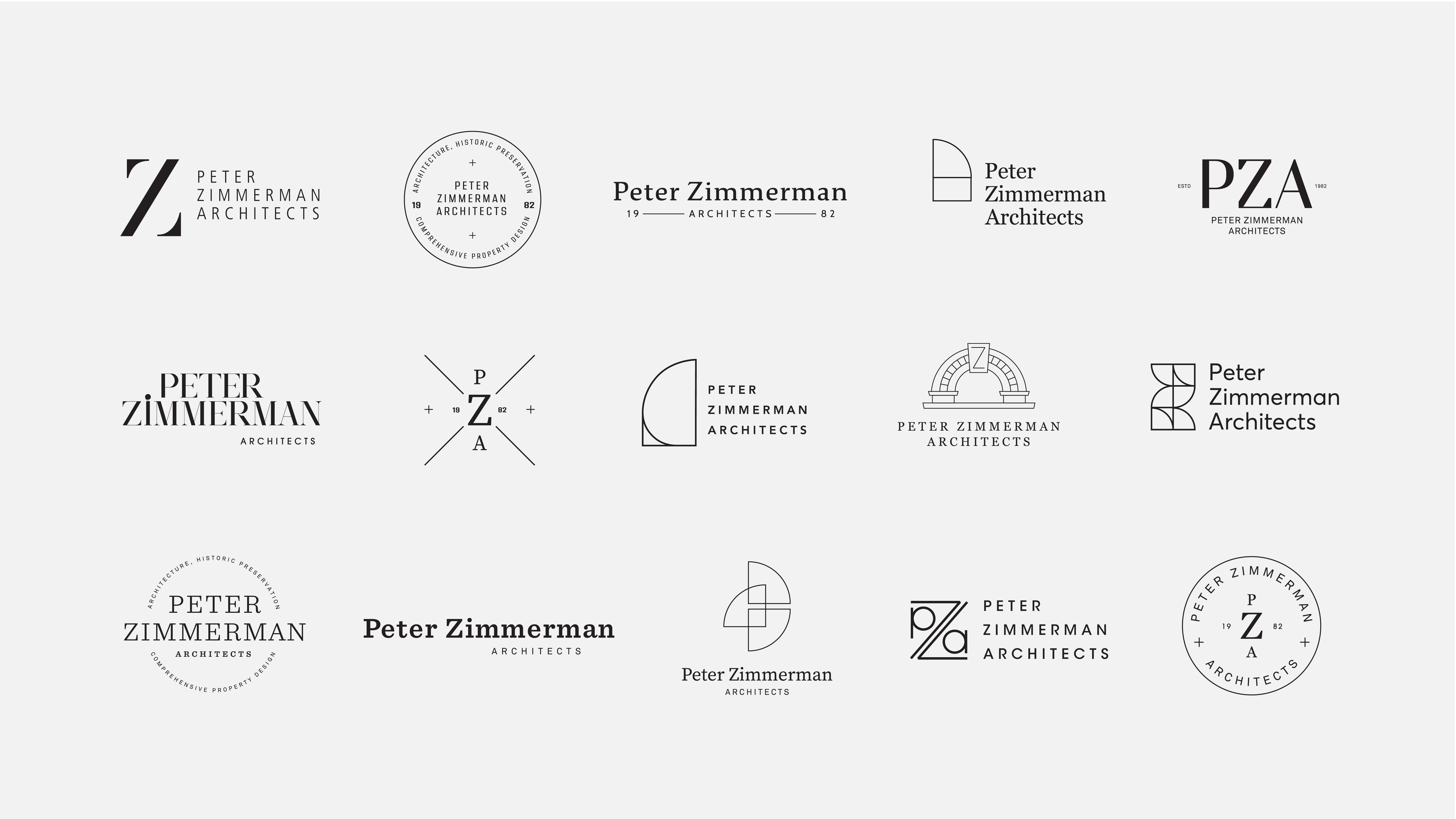


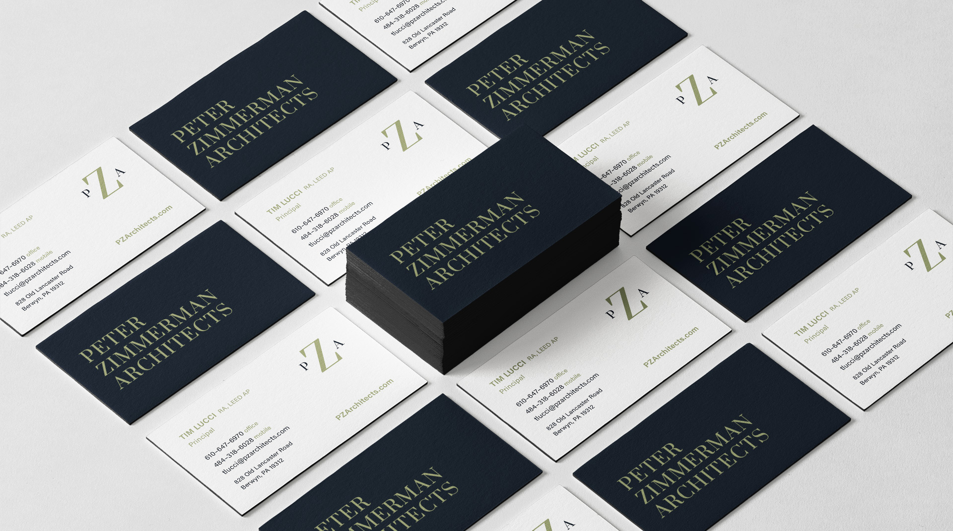
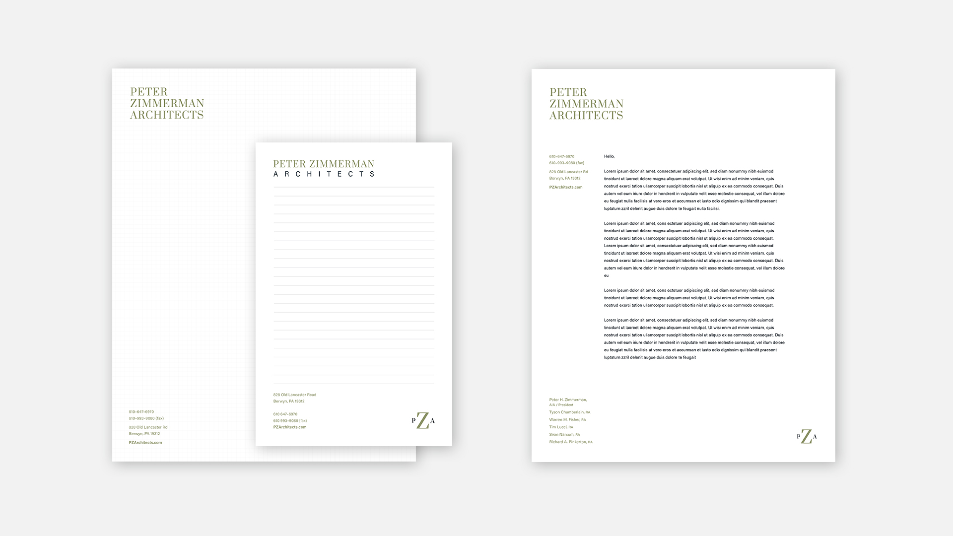
The new logo demonstrates the classic elegance of the brand in a modern format. We paired a refined but readable serif typeface with a cleaner sans serif in a thoughtful and precisely laid out manner. The color palette is subtle and sophisticated so the photography and architecture can stand out.
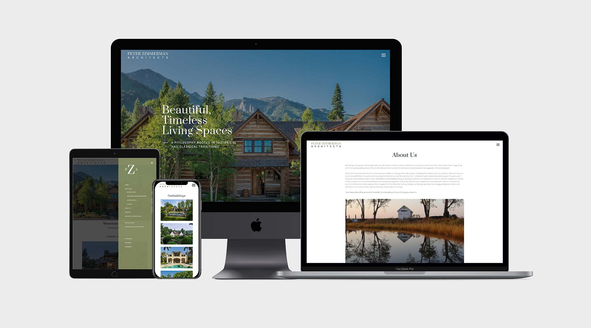
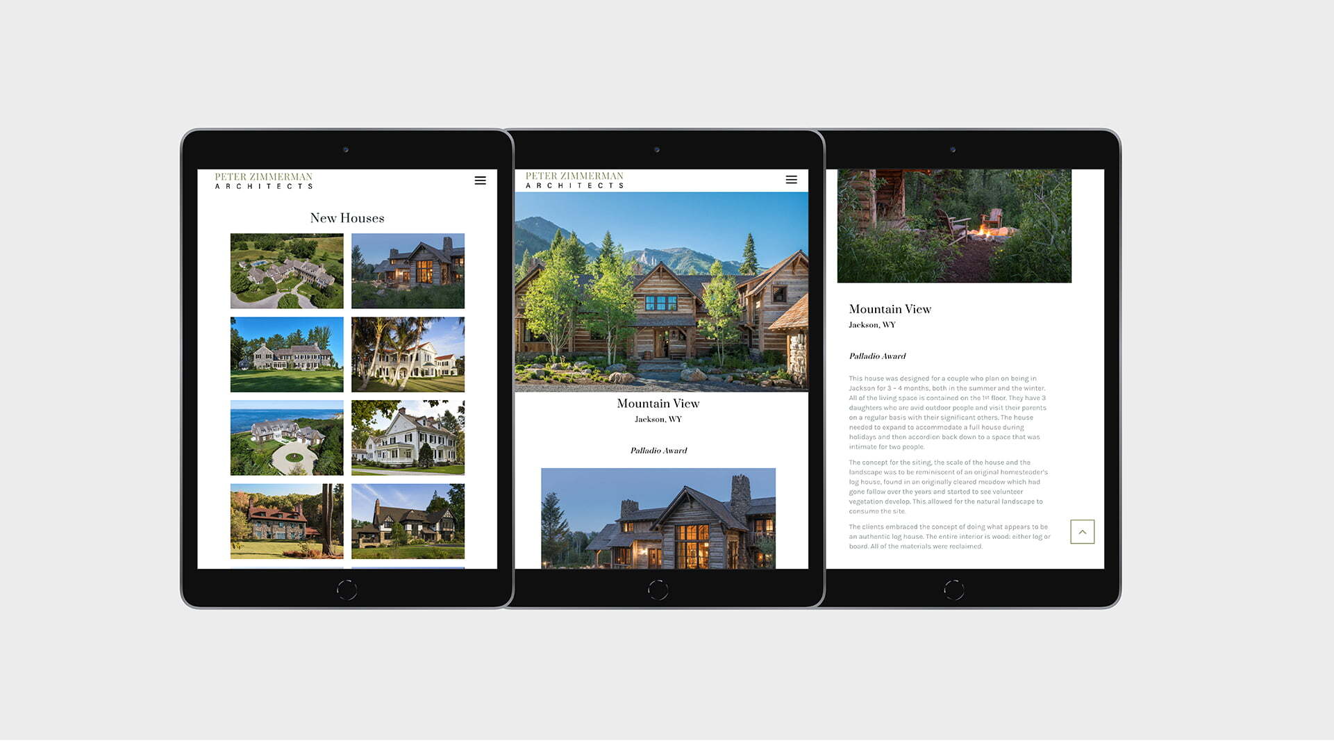
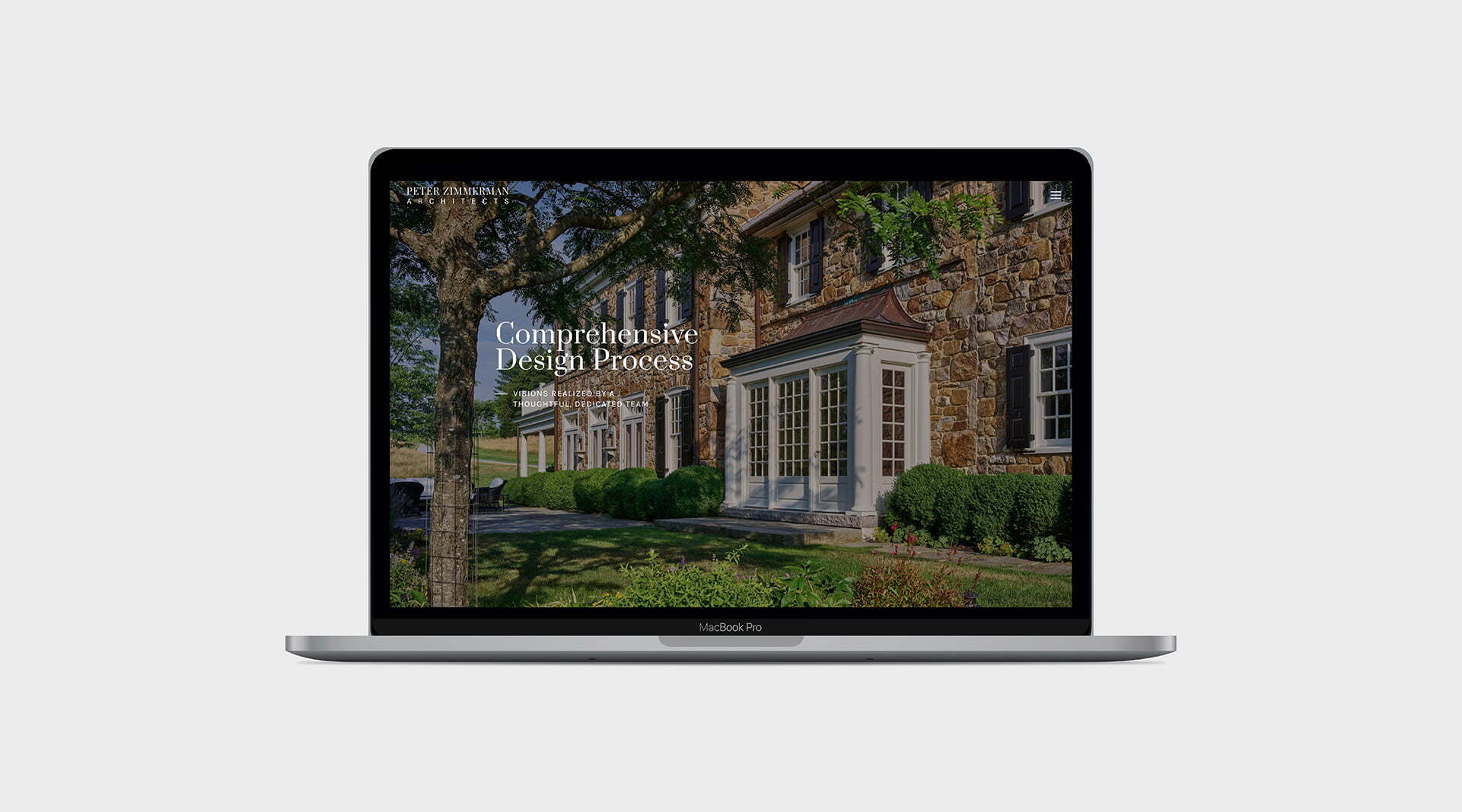
Our website design agency implemented a templated WordPress website to showcase PZA’s beautiful, classic work. The primary aesthetics of the website are black and white, with a brand green accent as the navigation background color and colored portfolio photos as the majority of the site color. The site was designed with an overall minimalist approach in order to allow the beautiful architecture work to be the primary focus of the site. The most important and prominent part of the website are the portfolio pages, the CTA being purposely less important and only present in the footer and the navigation.
Photos by Peter Zimmerman Architects