 Get In Touch
 Get In Touch
The LVL 4125, a new apartment building in University City, needed a quick turnaround on a new logo and landing page to start selling their units as fast as possible. They wanted a sleek, modern look that drew upon the unique modular style of the building.
We used a streamline creative process to come up with an effective logo and landing page at an accelerated pace. The sleek color palette and geometric design used throughout produced a luxurious look and feel that fit The LVL’s brand story. Our PR team also got the word out throughout local news outlets to generate interest in the new rentals.
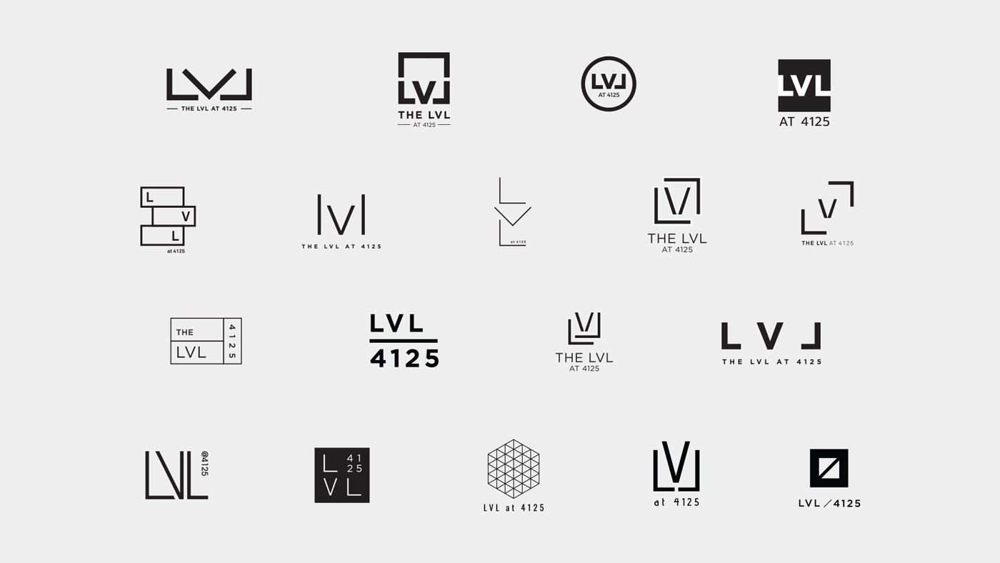
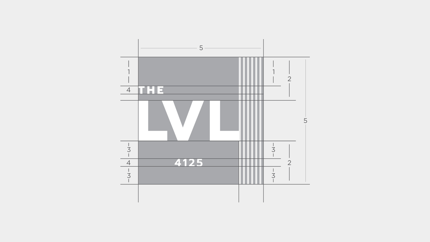
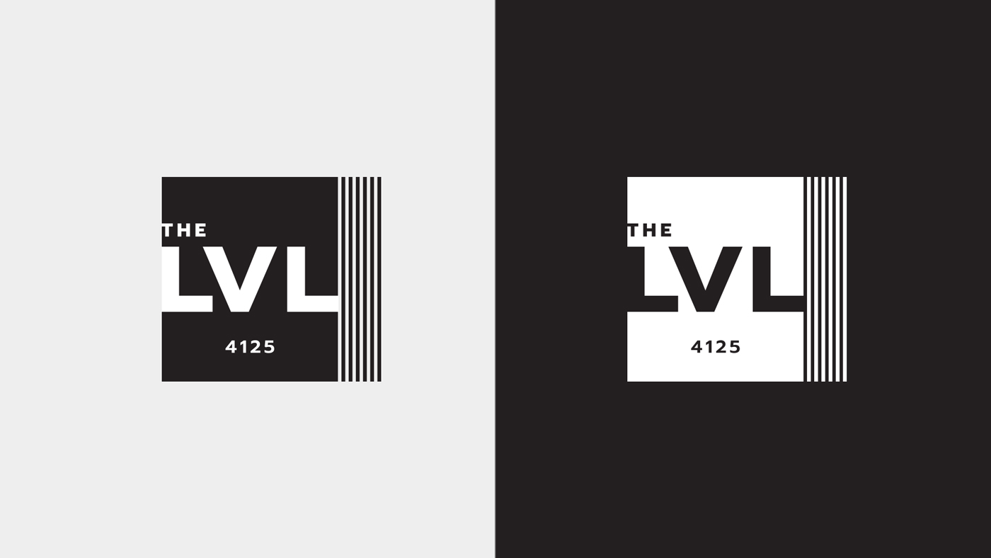
The geometric design of the logo represents the modular style of the building and, more specifically, the LVL beams used in the construction that it takes its name from. The black and white color palette contributes to the sleek look of the brand.
The landing page utilizes the limited color palette and clean brand look to display all relevant information about the apartments, amenities and surrounding area. The site expresses the luxury feel of the brand while also serving as a practical tool to effectively learn about and apply for the apartments.


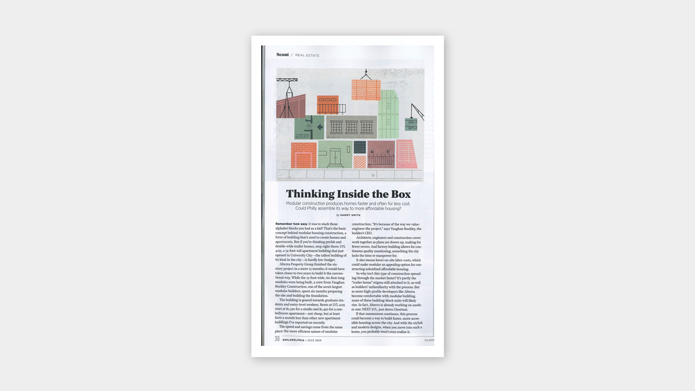
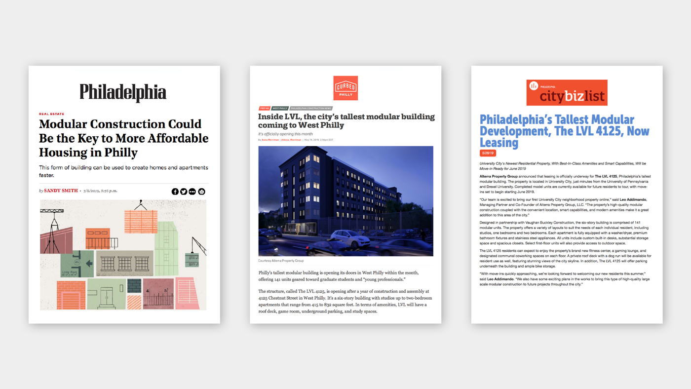
Our PR team leveraged the unique modular nature of the building to garner press in major local news outlets, both online and in print.
Photography by Neff and The LVL 4125