 Get In Touch
 Get In Touch
Liberty Inspection Group is a property inspection company operating in Eastern Pennsylvania, Southern New Jersey, and Delaware. Liberty works to ensure not only that properties are physically safe but also that the owner’s investment is secure and protected. They wanted to update their respected inspection brand with a new and more modern look that could be scaled up in the future as they grow.
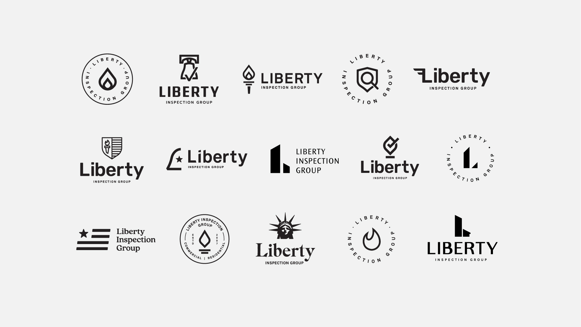
Our team enhanced the Liberty brand with an updated look that reflects their dependable service and the range of inspection work that they provide. The new branding demonstrates Liberty’s trustworthiness and professionalism and captures the commercial and residential services in the icon.
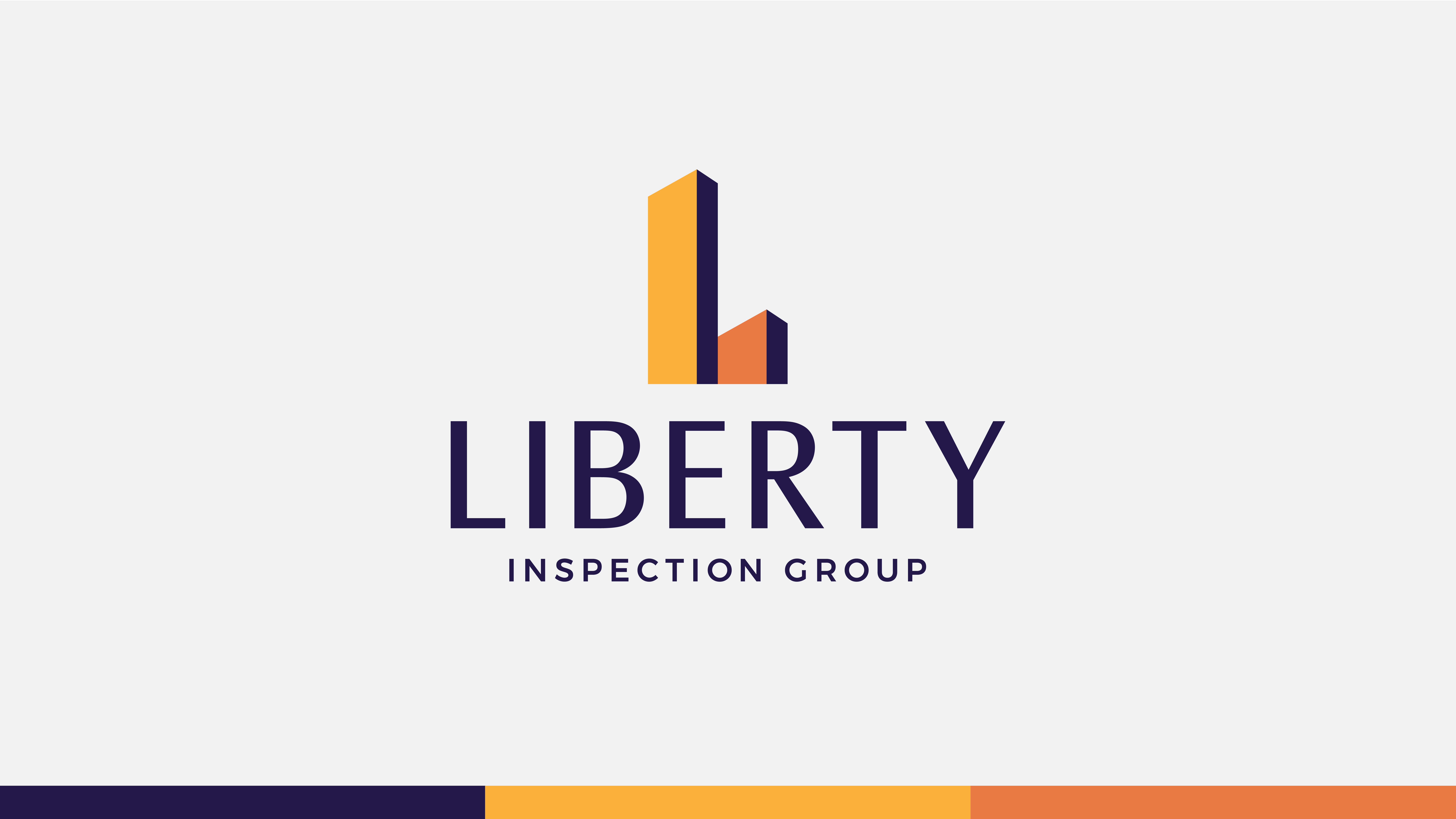
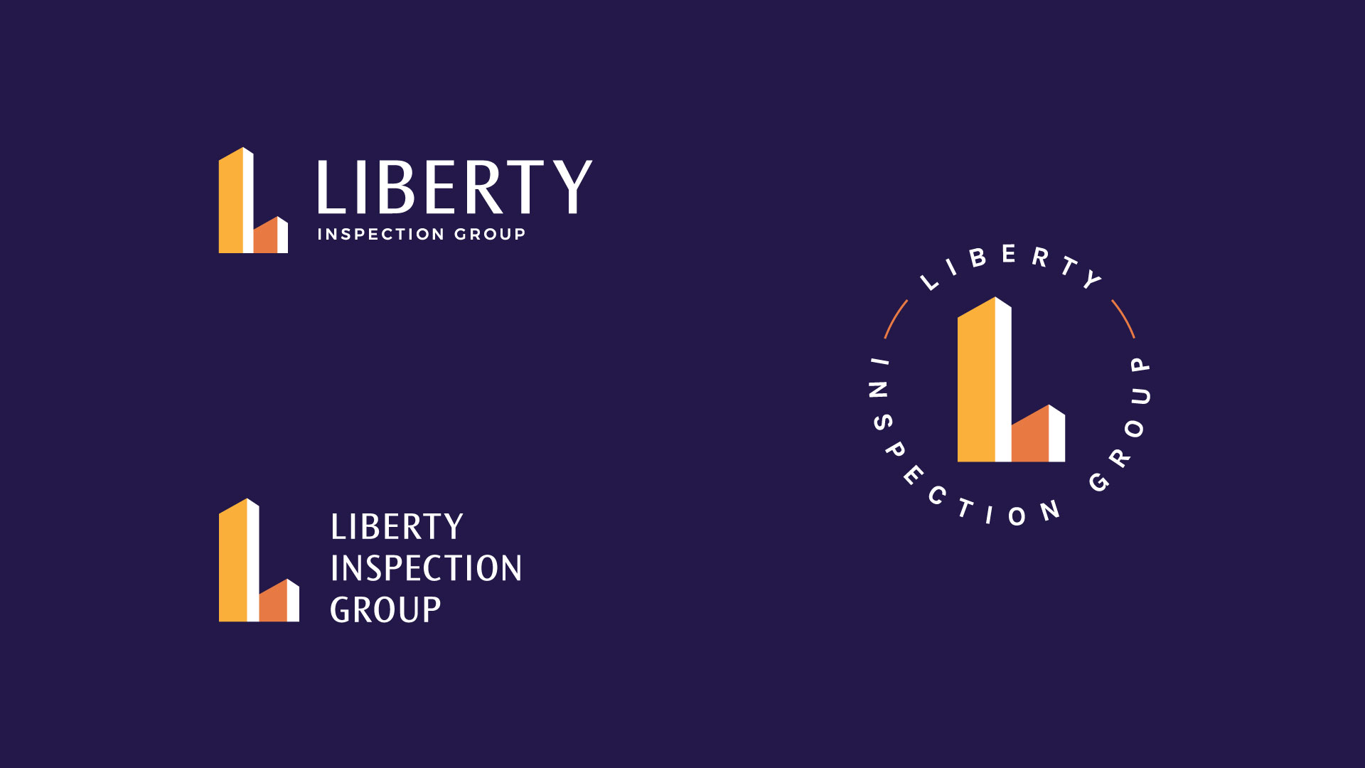
The new logo reflects an updated look that is a logical continuation of the original brand. The icon depicts two building structures that stand for commercial and residential services, while also representing an “L” for liberty. The updated color palette references the unique purple that sets the brand apart in the market while giving the logo a cleaner and more modern feel.
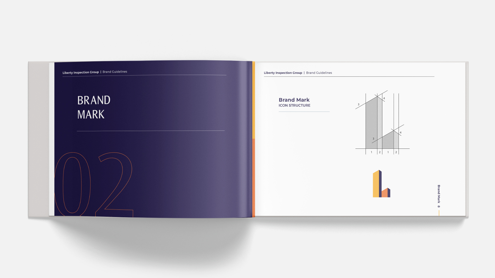
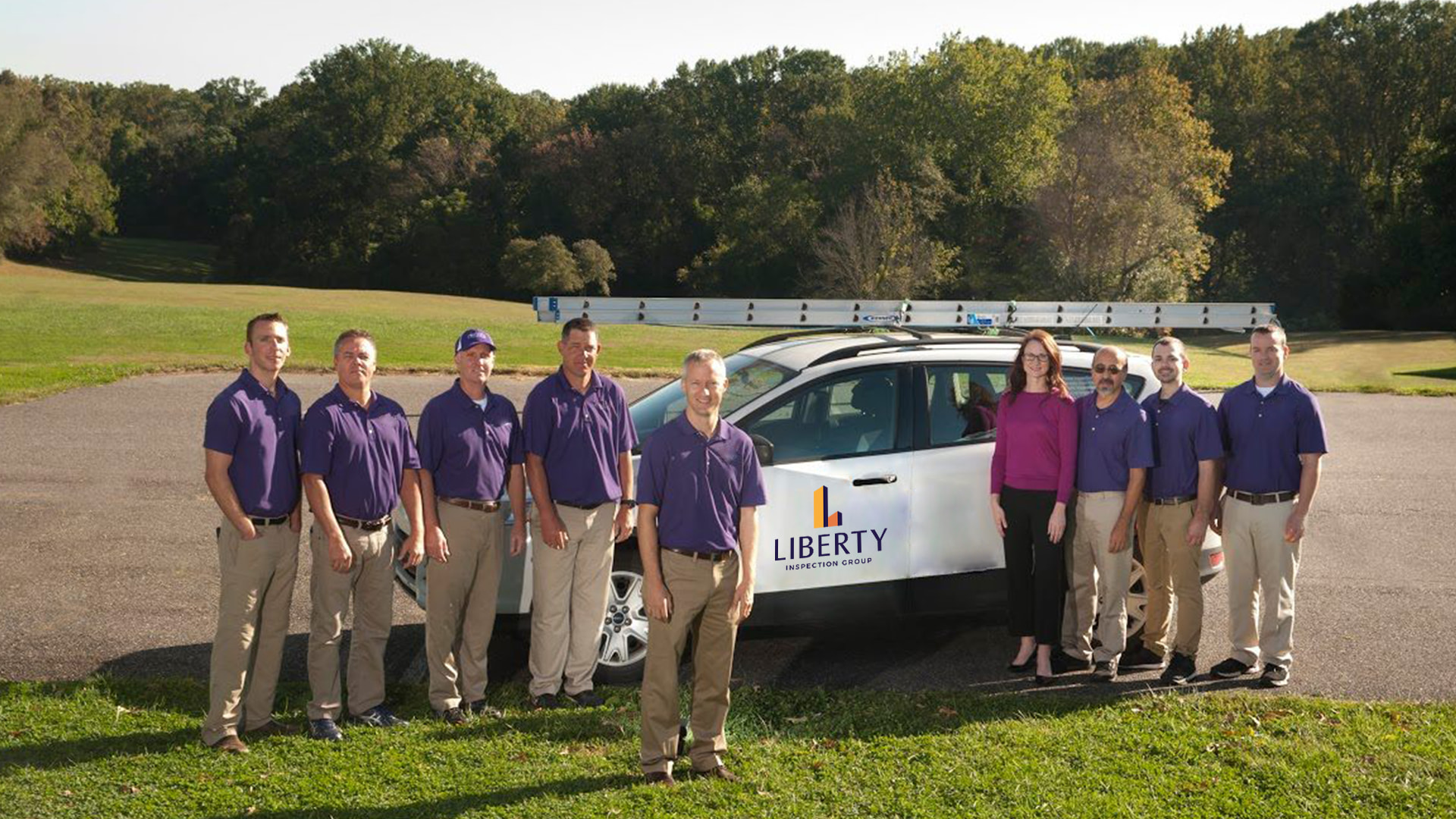
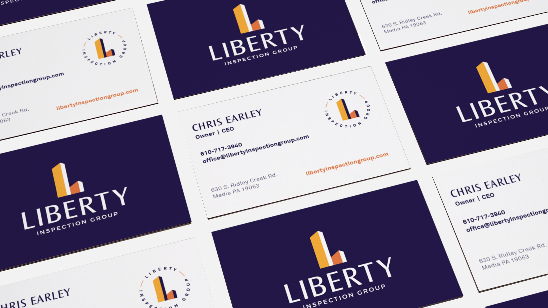
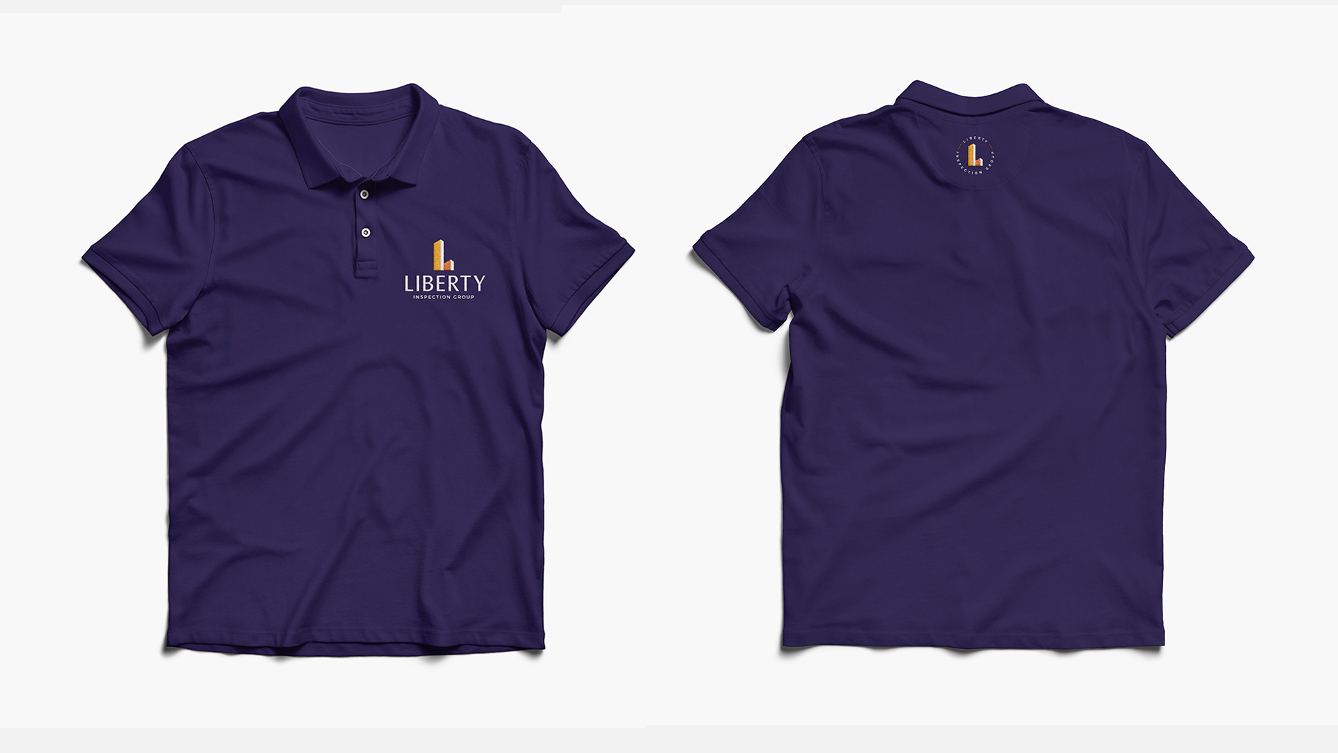
After completing the updated branding, our team then translated these visual assets across Liberty Inspection Group’s identity. The corporate identity includes business card, letterhead, envelope, vehicle, and shirt designs.
Photos by Neff, Liberty Inspection Group and Unsplash