October 13, 2023
Authenticity in Marketing is Vital to Sustained Success...
Choosing the right fonts is key to a great logo. Logo branding is essential to your business, and type is a key aspect of this. In a well-crafted brand, you may not even notice the logo typography at all. But the type you use should make an impression and represent who you are.
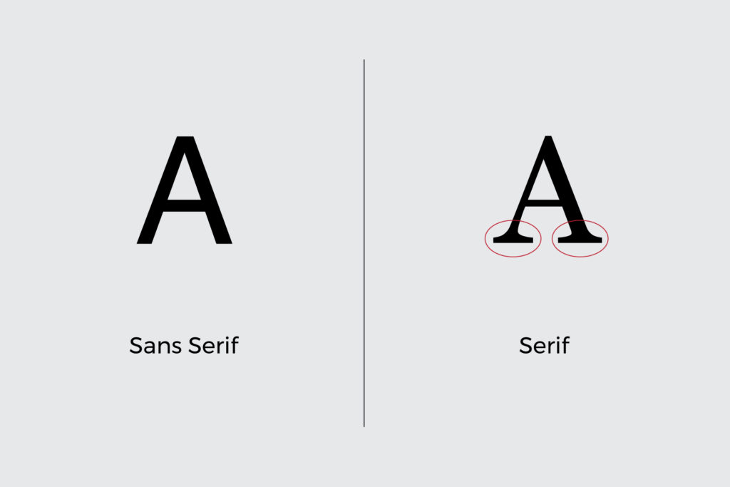
There are many aspects to logo branding and typography, but the two major categories of fonts are serif and sans serif. Serifs are the small lines that look like little feet on the ends of the letters. Older, more traditional type styles have serifs. Sans serif fonts do not have these decorative details. They are more contemporary and clean looking.
Your brand will determine the best logo typography for you. If you want your logo to have a more traditional look, serif will be the best choice. This style comes from classical typography and connotes elegance and tradition. For example, the secondary logo for Peter Zimmerman Architects is in an uppercase serif. This makes sense for their brand because the firm has a more traditional style rooted in classical elements.
If your brand is more contemporary, a sans serif font will be a better fit. Sans serif type is more minimalist and simple. This style will feel younger and easier to read. The logo for Alarm Connections demonstrates sans serif type in action. This works for the brand because the company is newer and going for a younger feel.
During the logo design stage of logo branding, it is common to see different kind of fonts paired together. You may want to use a serif font for the main wordmark and a sans serif font for the tagline, because the tagline copy is smaller and sans serif fonts are more legible. Using more detailed serif style fonts for all the copy in your logo will likely make it less readable. Pairing multiple fonts together is a standard professional approach in logo design. The logo for Harth Builders demonstrates this pairing.
In summary, the basics of logo branding and typography involve first selecting serif or sans serif fonts. Consider the vibe of your brand and which of these styles would be the best fit. You may also want to combine type styles if your logo includes a smaller tagline. Then you can tackle the rest of the details that will make your logo stand out such as color, spacing, and capitalization. You may not always notice fonts, but that doesn’t mean they don’t matter. Logo typography will influence a viewer’s impression of who you are at just a glance.
However, when in doubt, it’s always best to turn to the professionals. For over 30 years, the Neff team has helped businesses find their brand’s perfect logo with comprehensive logo and branding services. Whether your business is rebranding or just hoping to revitalize its logo, you can rely on our team of logo branding experts to develop a logo that will accurately reflect your brand.